
The logo needed to look natural, sophisticated and sustainable as well as smart, fresh and light. The new brand will bring a new, modern look and feel to the company, and will lead the website design refresh, also to be undertaken by Envy Web + Design.
Home > Graphic Design > Branding > Logo Redesign – Pure Journeys
This process was a deep-dive into their company; to uncover their roadmap for the future, understand their goals, their purpose, vision, values, brand personality, key audiences as well as the competitive landscape.
Out of this workshop we discovered that their key point of difference is that they are constantly striving to be ambassadors for their clients and the environment – by creating personalised, experience-rich, sustainable holidays. Along with the rest of the information gathered in the brand workshop, this set the stage for us to begin working on their logo design.
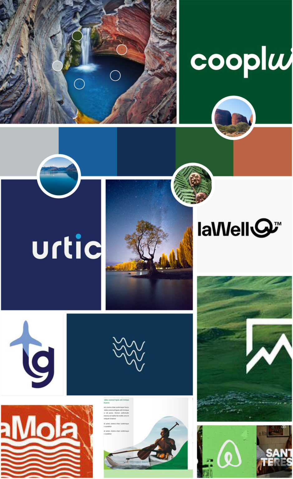
We started by creating a mood board. Mood boards are a fantastic tool as it allows both the designer and the client to get on the same page in terms of style, colour and feel.
So we did. By taking this stylized map pin shape, and flipping it around, we were able to create a simple, yet effective, mark. The icon represents:
The icon was made into a pattern, and was also provided as individual shapes so it can be used with versatility.
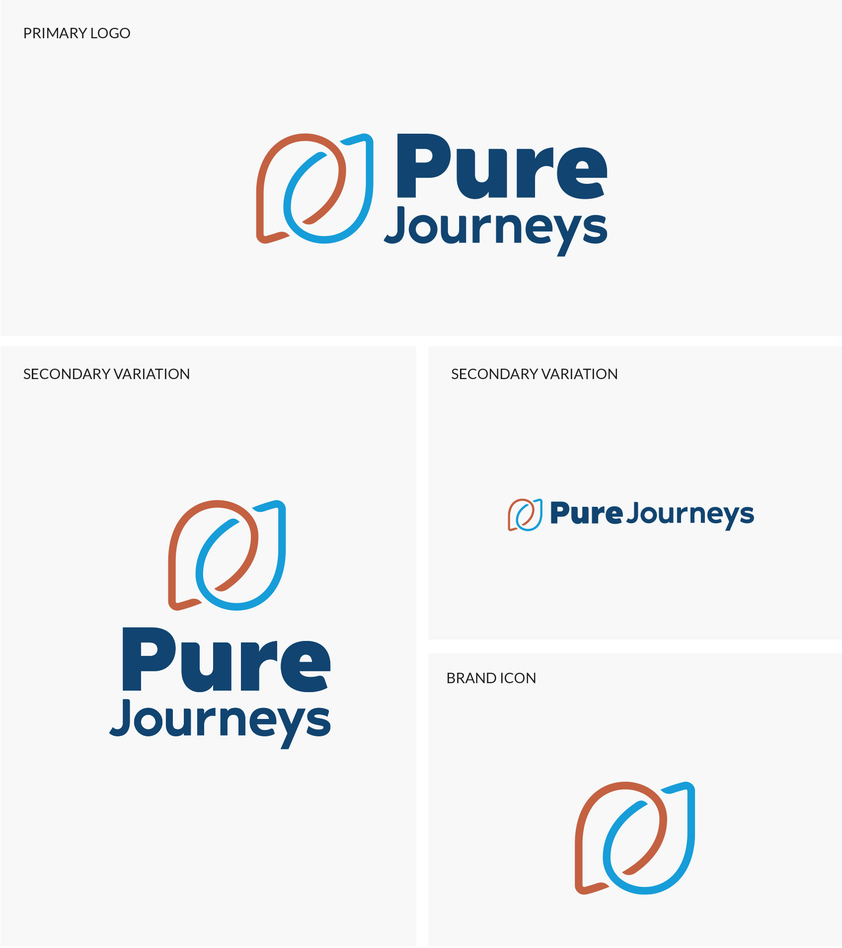
The primary variation of the logo is the stacked version, with the icon to the left. We also provided a more vertical option, with the logo on the top, and then a horizontal variation where the text is on one line.
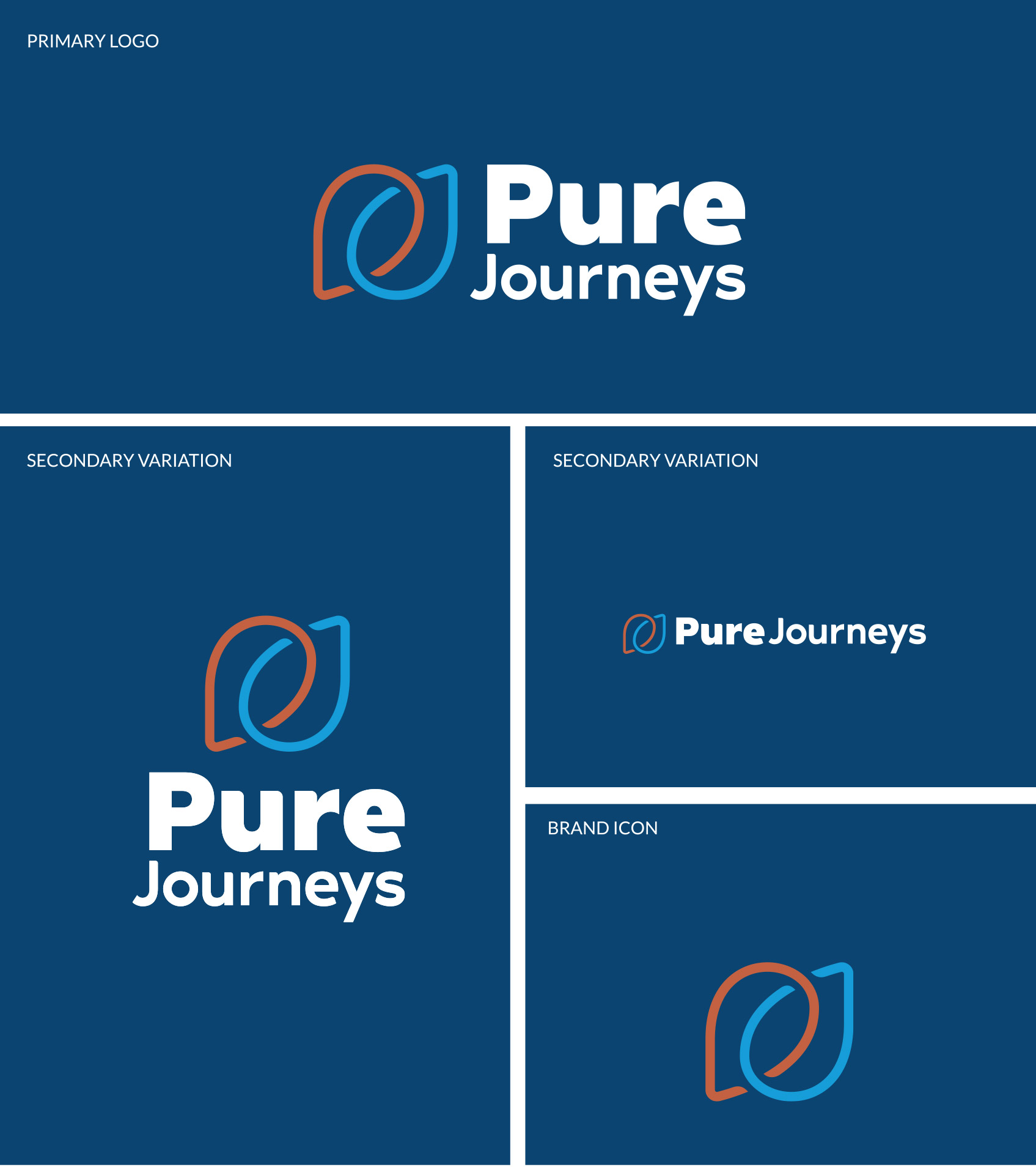
Options for use on light and dark backgrounds were provided, as well as black and white variations.
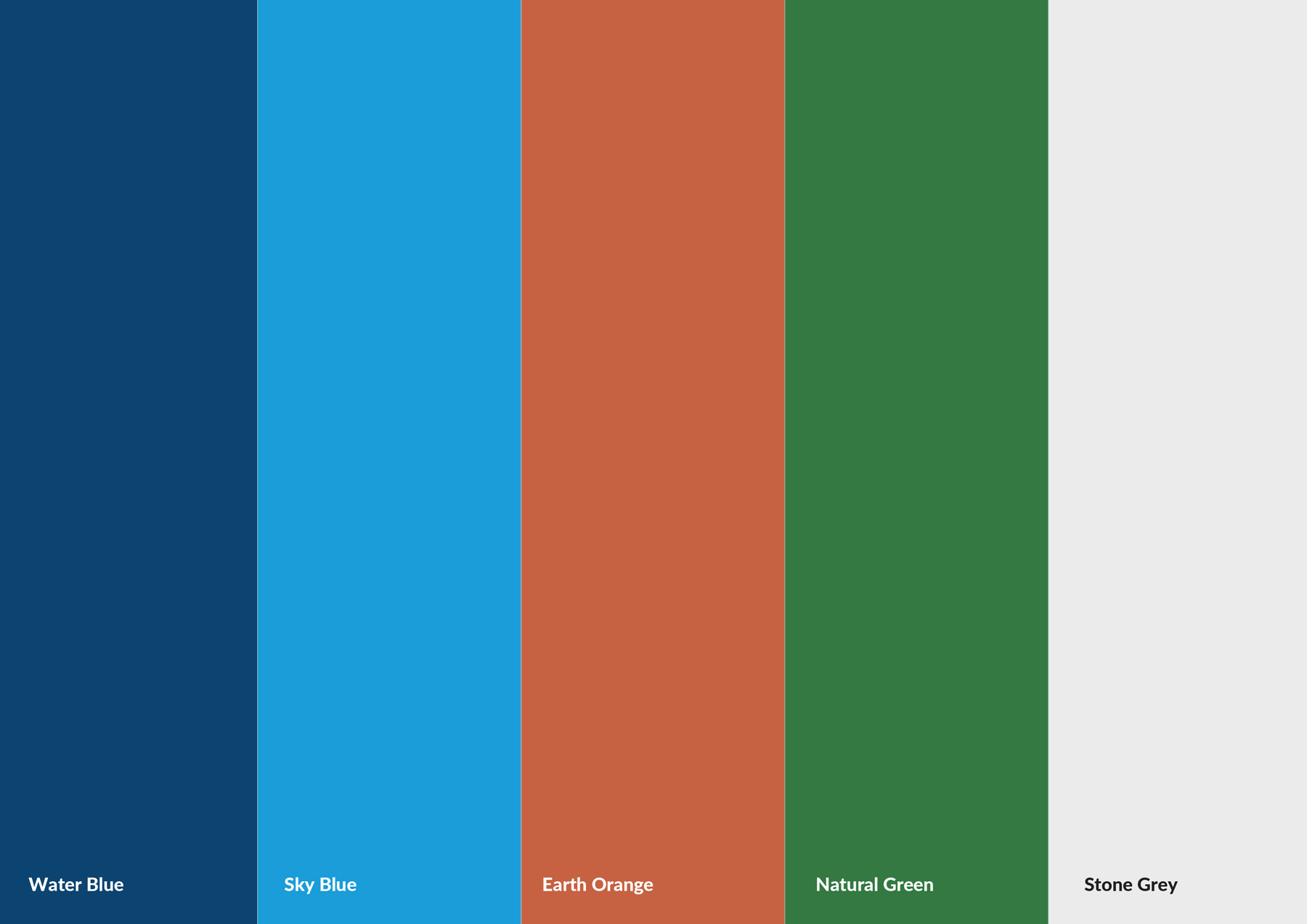
We did this by using rich forest greens, alongside deep, earthy oranges and vibrant blues. You can see some of the reference images we used in the original mood board.
You can see this in these bus stop posters – the map pin is almost like a rainbow – however instead of occupying a horizontal plane across the image, by making the start point in the foreground, and the end point on the horizon, it makes the shape span a distance and tell a story.
