We’ve been working with Anna on her website for many years, so we were delighted when she approached us to work on a rebrand. The brief was to create a brand that looked “folky but timeless and high-impact” – Anna wanted a logo that would elevate her brand perception and take her forward.
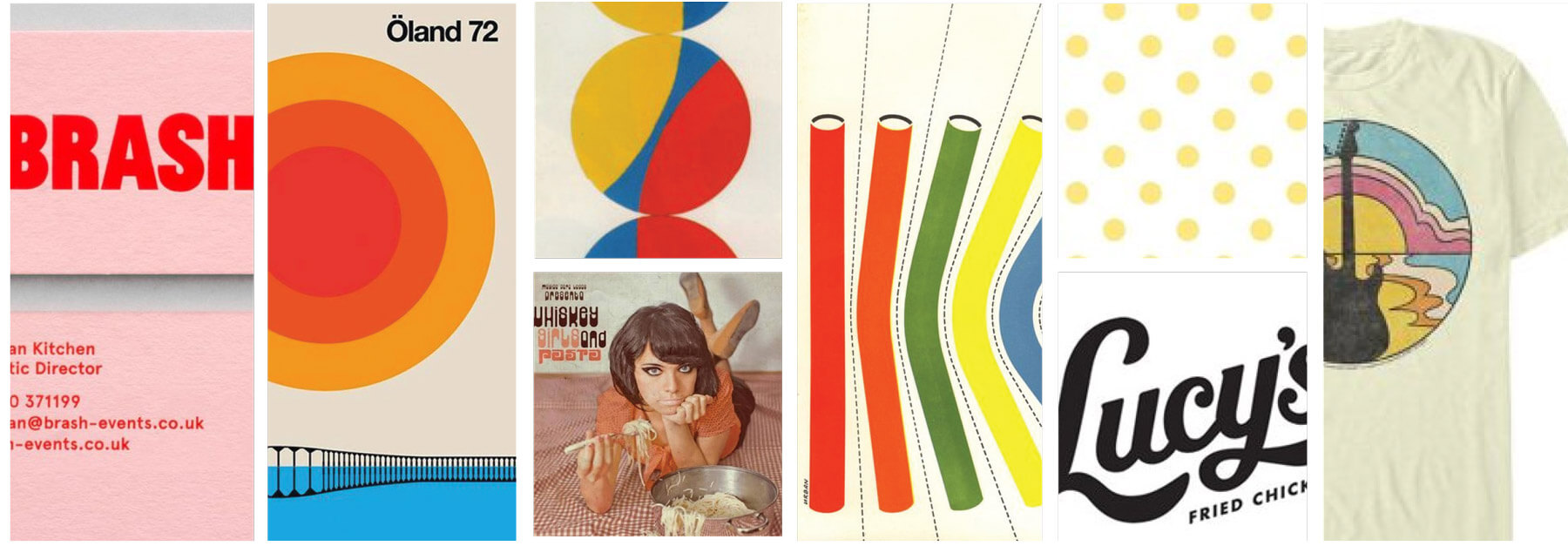
Visually she was drawn to vintage, 80s designs with an earthy feel. Anna expressed that the logo should be eye-catching, say “music” when you look at is and have a welcoming vibe.
With that in mind we explored a whole lot of different options, but the one that stood out to Anna was inspired by typographic musician and band logos, and vintage script type.
Home > Graphic Design > Branding > Logo Design – Anna van Riel
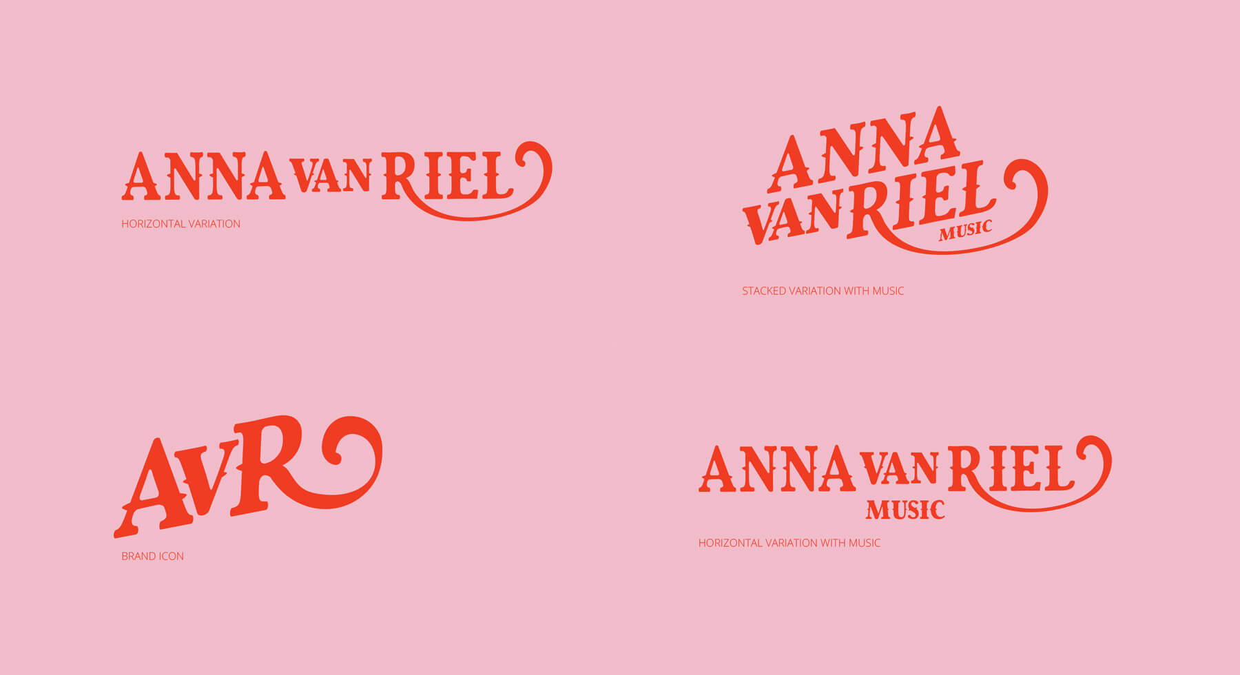
Inspired by vintage lettering styles, the logo is designed to create a retro feel – it echoes Niel Young’s iconic Harvest album font, and has a strong vintage feel. Rounded styling adds to the relaxed, folk feel; creating a bold mark that stands out. The primary logo is the red, stacked variation used on light pink.
We provided versions of the logo with, and without, the word MUSIC. This allows Anna flexibility to decide when she wants to use it.

It creates a folk vibe that echoes the bold and colourful styling of pop art from the 1960s, 70s and 80s.
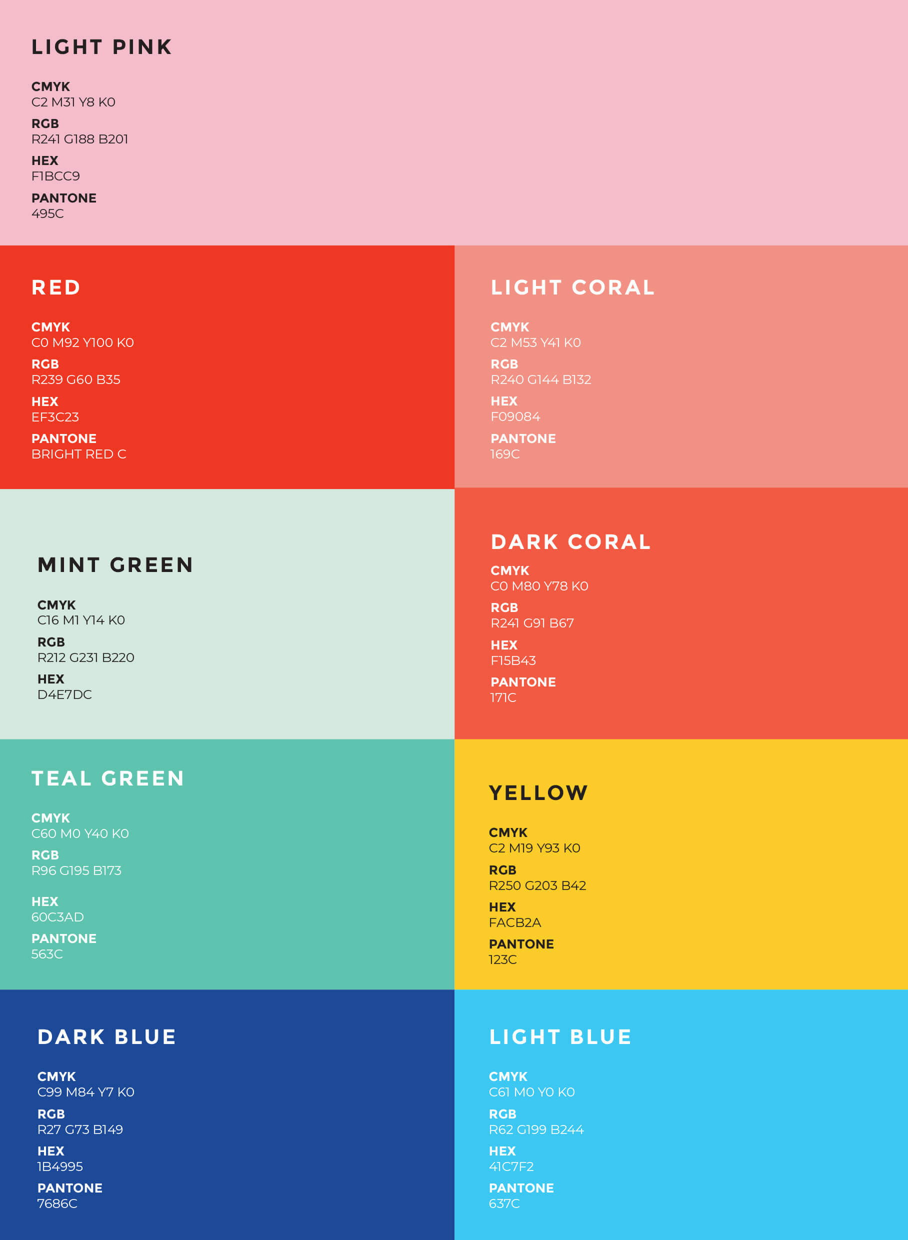
The primary colours are red & pink, and teal. Followed by mint green and blue. These quirky colour combinations create a memorable brand and one that stands out.


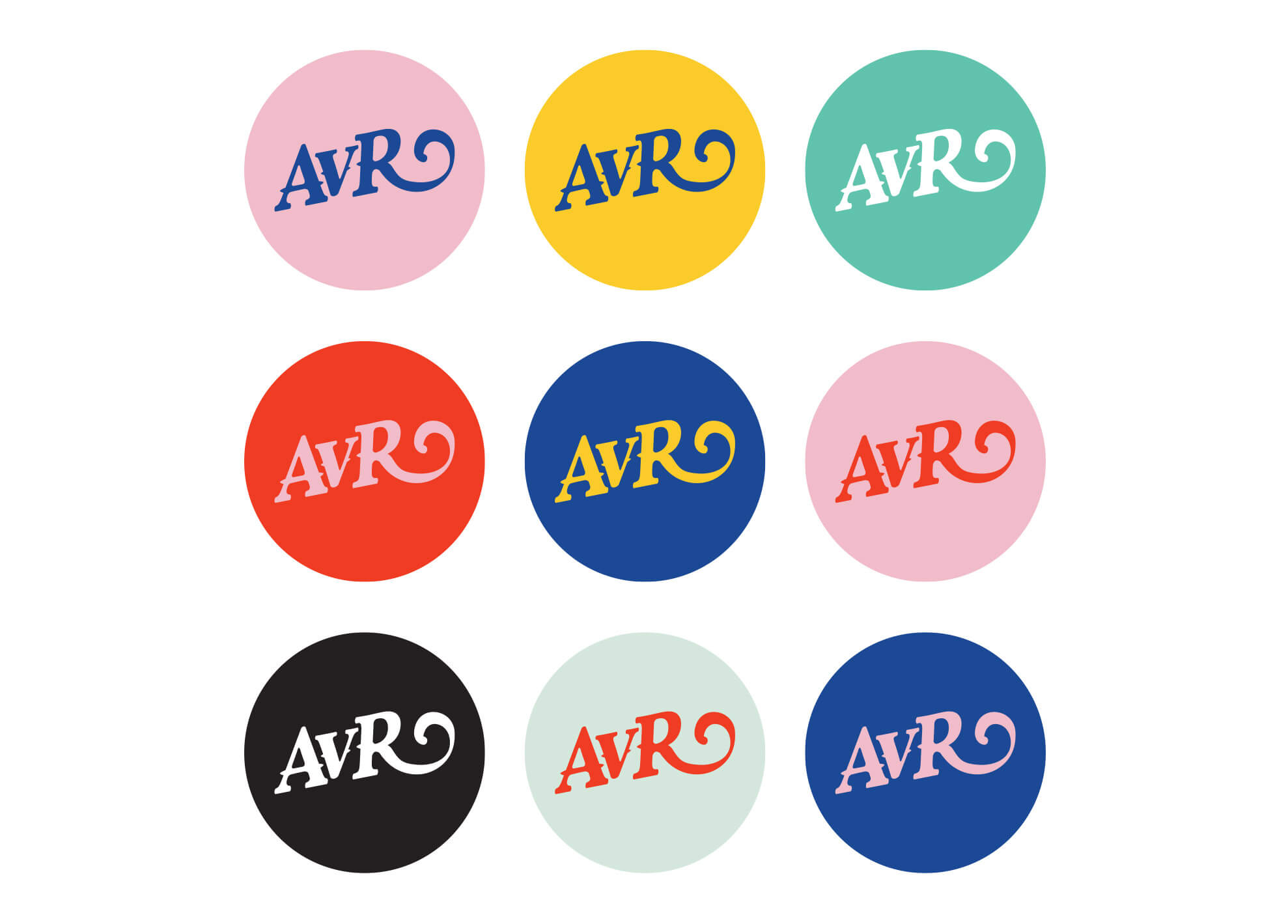
A variety of circle brand icon badges were provided for use. These are a mix of the primary colours – using the most high-contrast combinations.

