
Going out on her own in order to better serve Rotorua families, Nicole needed a brand that would convey her unique approach. With a background in education (Nicole is both a registered teacher and educational psychologist), Nicole understands what it is like for both children and teachers in the classroom. This means way she supports families, children and teachers is realistic, positive and practical.
Home > Graphic Design > Branding > Logo Design – Nicole Lovegrove Educational Psychologist
Using the imagery of a hand holding an olive branch, we wanted to convey a couple of things. It represents the way Nicole cares for & nurtures her patients to see them grow and bear fruit. The olive branch was chosen to represent this, as it is a symbol of peace and friendship. This represents how she works with families to bring peace back to the minds and hearts of young people. Stars add visual balance to the logo, and also represent imagination, learning, excellence and achievement.
“Helping children to shine.”
– Nicole Lovegrove
We used a reference photograph of a woman holding a flower to illustrate the main part of the logo, then found a second reference photo of an olive branch. We then stylised this to match the design style of the logo.
The main font is a playful, but professional, serif font. It has soft qualities that create a warm and approachable impression. The secondary font is a simple and refined sans serif in all caps. This balances nicely with the main font – creating a sense of professionalism.
We wanted to create a very versatile and flexible brand for Nicole, so created a range of different logo variations she can use.
A good logo is able to be used in every situation. One challenge with this logo was the small tagline. As legibility will become a concern as the logo becomes smaller, when needed small there is an option with no tagline. For variety, there is also a fun arc variation of the logo lockup, which allows us to add more text in “EMPOWERING CHILDREN”.
A brand icon was created out of the letter N, using the olive brand to form part of the letter. This creates a unique and beautiful icon that can be used when a very small representation of the logo is required. It is also effectively used in the round badge variations of the logo.
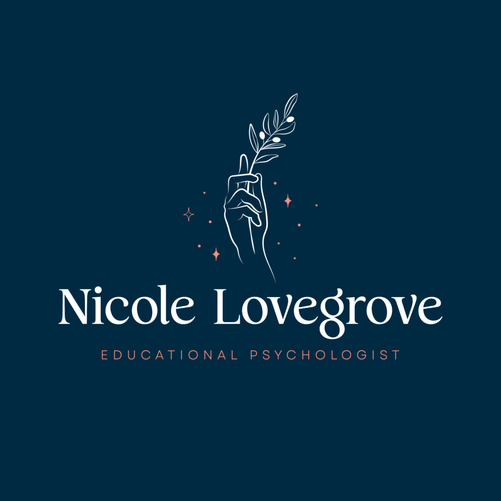
Dark blue serves as the main brand color. Following closely is coral. Dark blue is the preferred dark background color, while white is the preferred light background color. A secondary colour palette of light blues and pinks was also provided.
As we weren’t building the website, we created a guide for the web developer which let them knew the right fonts to use online, as well as the look and feel of the brand through the creation of a mood board. We also wanted to ensure that whoever else used the brand, had a clear idea of how to implement it to ensure across all marketing materials.
The goal is to create a professional suite of materials that will convey a cohesive brand and show the values of:
• Collaborative
• Caring
• Optimistic
• Dependable
• Open-minded
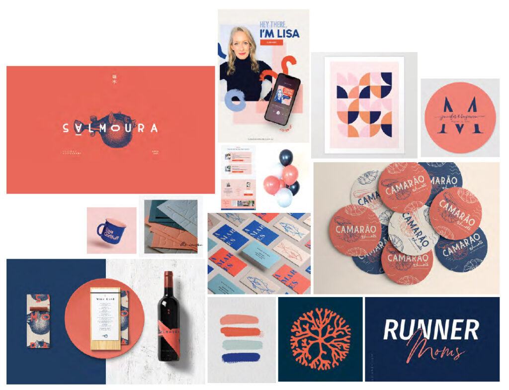
The mood board below provides inspiration for marketing materials and the website, as well as the overall look and feel of the brand in action.