The Process
I would be lying if I didn’t say I was slightly intimidated when I read the project brief! The design references were wide and varied and I wondered how I would combine them into a single logo:
- geometric patterns, especially Art Deco vibes
- the Golden Ratio (mathematical) spiral, which also looks like a cochlear spiral (inner ear).
- brain and neuroscience (study of nerves).
- Da Vinci’s blending of art, math, and anatomy in the Vitrivian Man drawing
- anything to do with water – especially the ocean and the beach
Agnella also provided some AI imaginings of this brief (detailed art deco styles logos). I reviewed these and then set to work – pulling out the main ideas and focusing on one or two at a time to generate concepts.
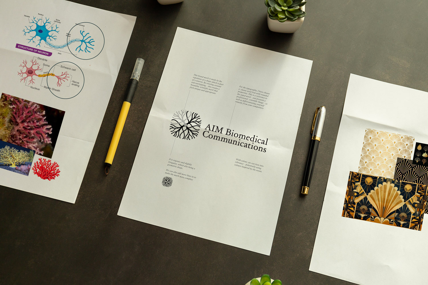
The first place I started was with the neuroscience reference – I researched what nerves looked like up close and discovered that the structure of the nerve endings on a neuron has a beautiful shape with a fan-like structure of tendrils. I also researched what identifies art deco styling – landing on the diamond and fan shaped repeating patterns. After playing around with simplified shapes based on the neuron, I saw that there was a visual connection between what the axon terminals of a neuron look like and coral – drawing in the ocean part of the brief.
For the first concept, I put all of this together and created an icon out of a repeated shape that spoke to all of these references.
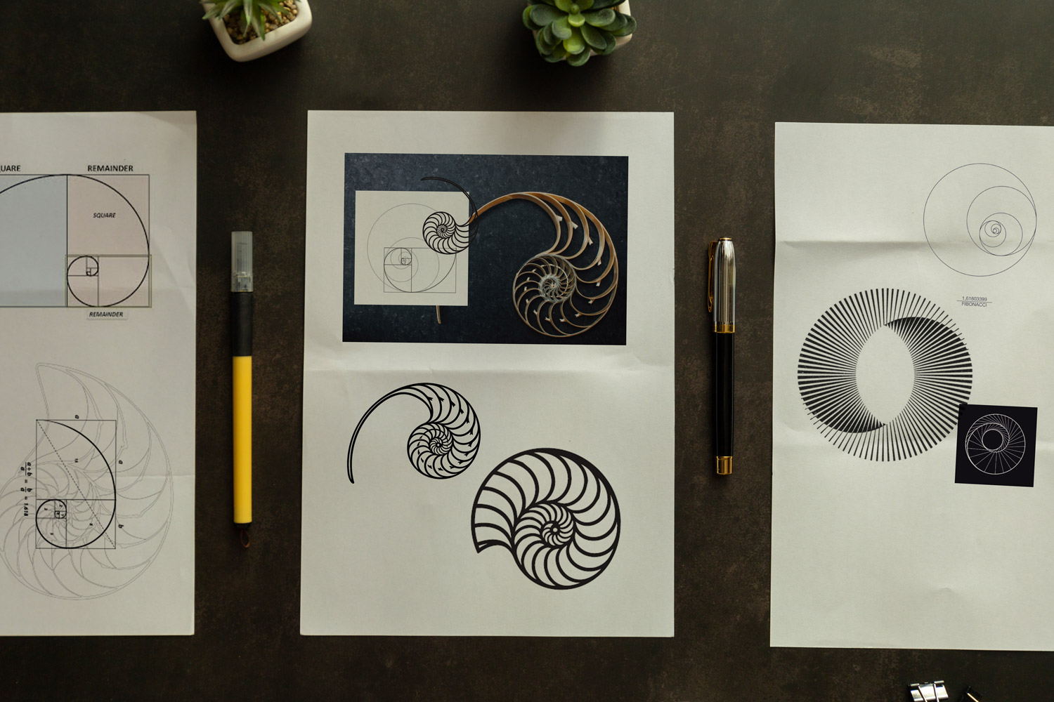
Next I worked on the design reference of the golden ratio and the nautilus shell. Throughout my research I saw interesting line spiral shapes and wondered if I could echo the idea of the nautilus by using a curved line to generate the shape. This is how we ended up with the approved design.
The Result
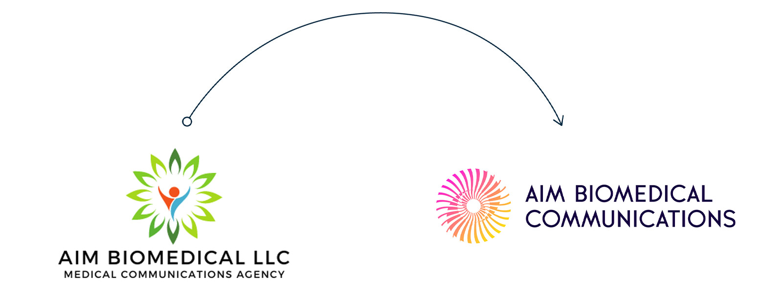
The new logo was designed to strike a balance between scientific precision and modern simplicity. We refined the typography to feel clean and highly legible, while introducing subtle visual cues that reference structure, systems, and innovation – core themes within biomedical work.
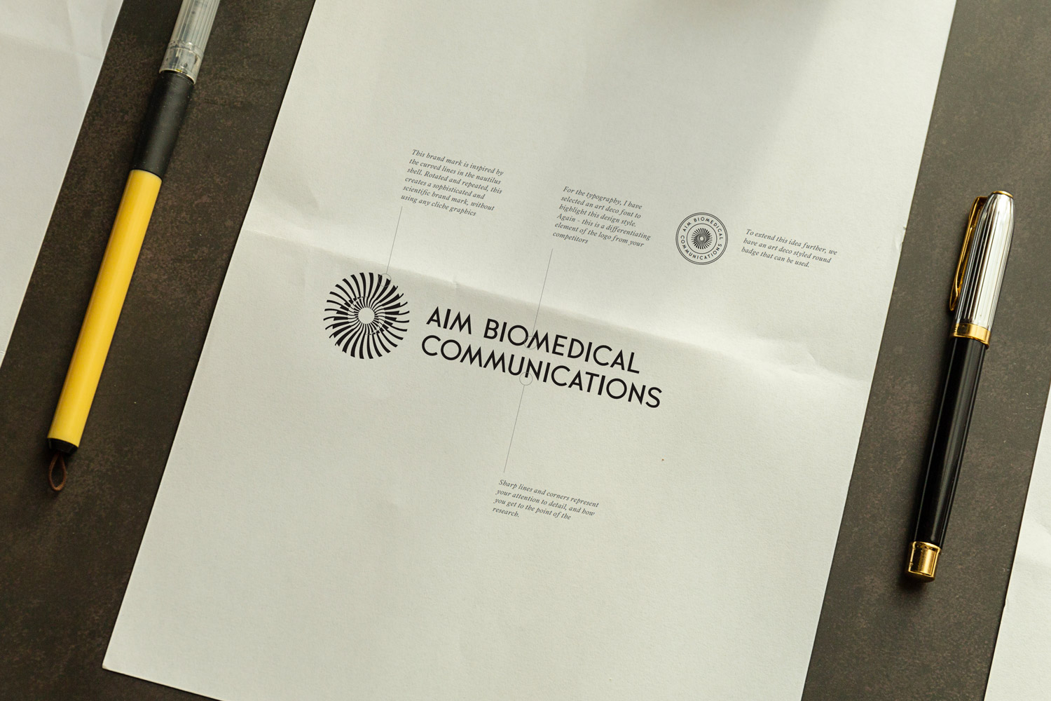
The result was a precise and technical looking icon the references the idea of the nautilus and the golden ratio. To introduce some of the art deco styling, I chose a font that has an art deco feel – placing this in all caps next to the icon.
The refreshed identity positions AIM Biomedical as a credible, forward-thinking organisation – one that reflects the quality and sophistication of its work. More importantly, it gives Agnella a brand she can confidently stand behind as it continues to grow.
This wasn’t just a logo update – it was about bringing AIM Biomedical Communication’s external presence in line with its internal capability.