Client: We Gather, Queenstown
Brief: To create a modern, minimalist logo for a new Queenstown based wedding hire company.
We Gather is a wedding & event furniture hire company based in Queenstown. They are passionate about helping people create their dream event with key, statement furniture pieces, that create spaces that uplift, inspire and impress.
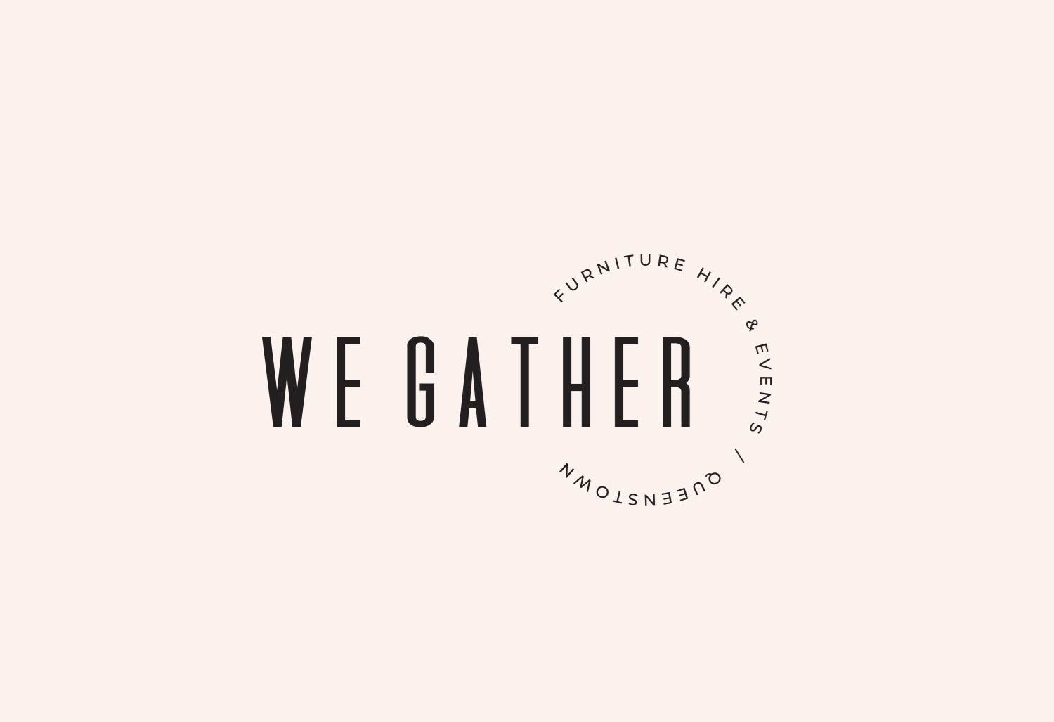
The primary logo for We Gather is horizontal in layout and features a circular tag line. This tag line encircles the word mark and creates a sense of community and togetherness.
The main font is a strong, vertical sans serif font. it has a modern & contemporary feel; its bold nature conveys solidity and trust. Circles convey positive emotions and here it is used to represent the notion of gathering.
LOGO VARIATIONS
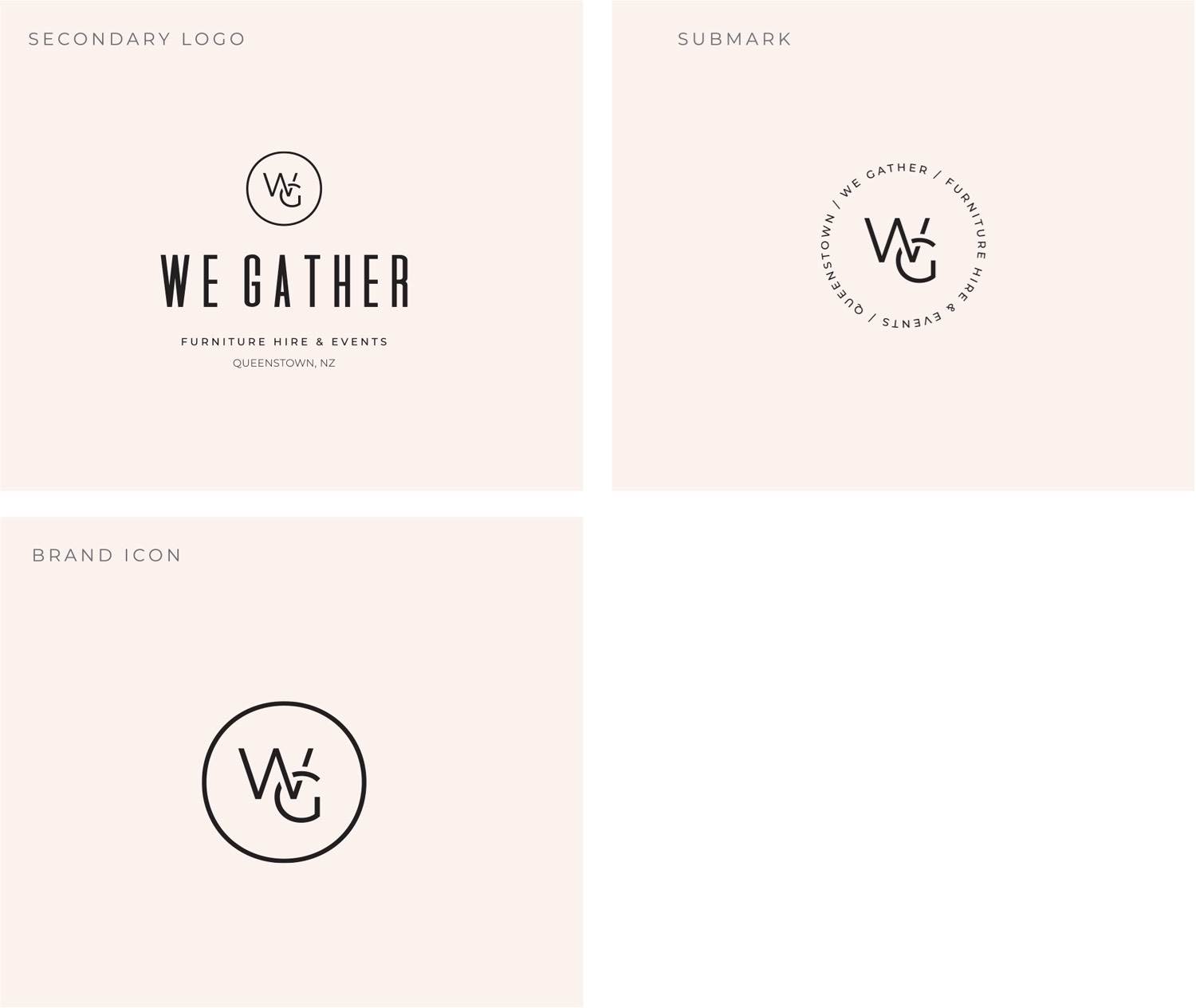
The letters W & G in the We Gather monogram are woven together. This further emphasises togetherness & partnership. The secondary logo is a stacked variation, with the tag line centred horizontally and it features the WG monogram lockup. This is useful for times where a more square-shaped logo is needed.
The sub mark features the circle tag line from the primary logo, with the WG monogram inside the lettering. The brand icon is a simplified variation – perfect for use when very small, or a simplistic brand mark is needed such as a website favicon or a stamp.
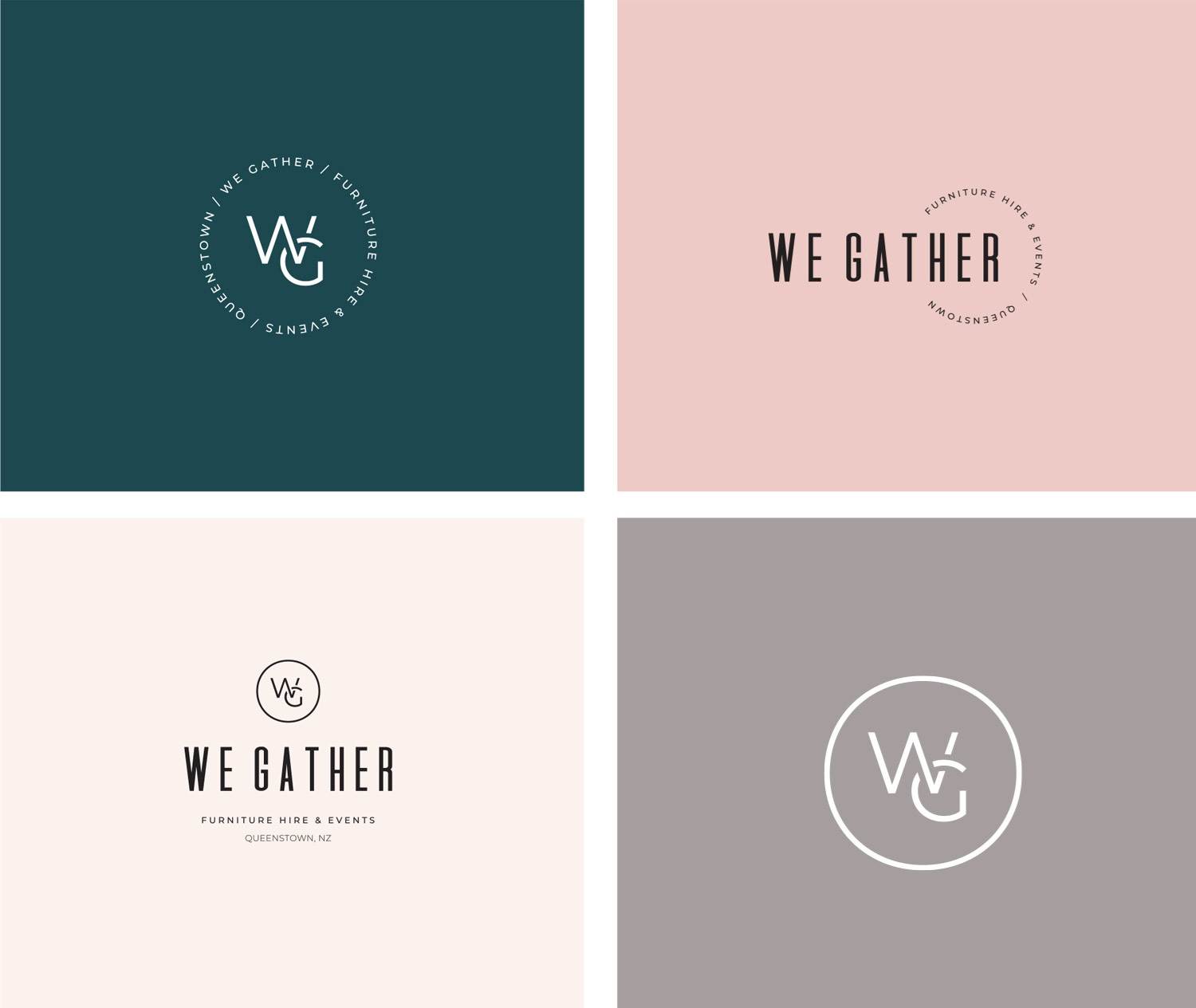
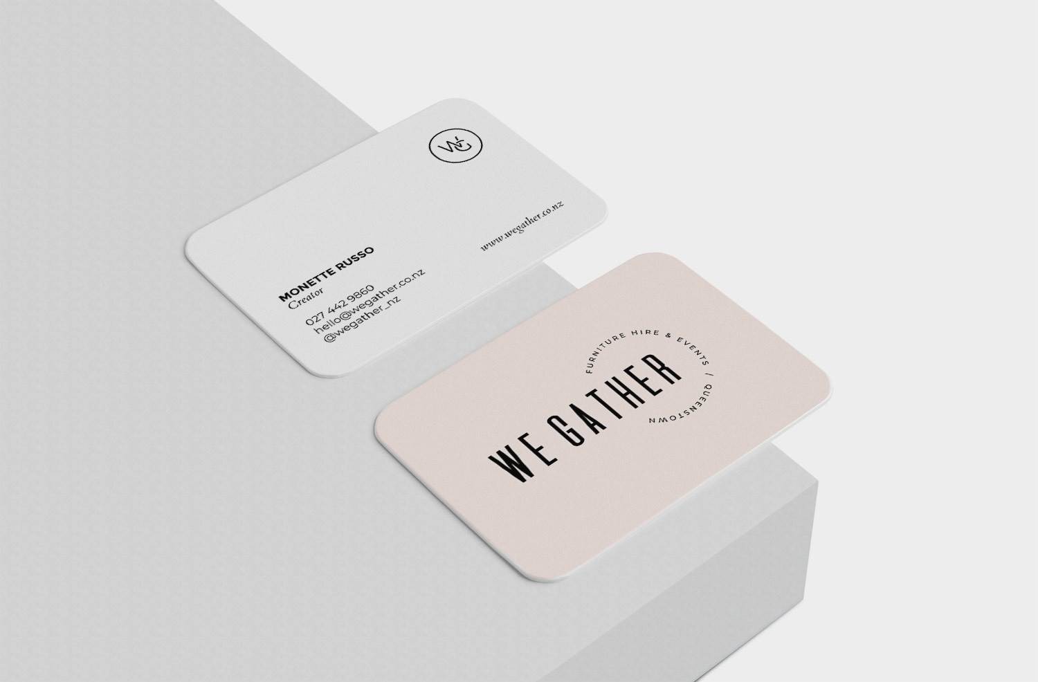
The two main brand colours for We Gather are shell and stone. These are the main go-to colours when they need to create a branding item like a flyer or business card, or when choosing theme key colours for a website.
The neutral and accent colours compliment these. The lighter colours can be used as backgrounds with the black logo, and the darker tones can be used as backgrounds with the white, or even gold foil, variations of the logo.
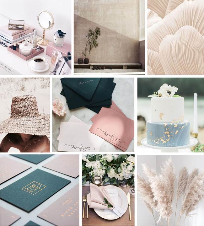
The tone for We gather’s photography and visual materials should be subdued in tones, with a light, warm pinky tone. Think lazy summer days by the beach. Colors are cool, subtle, pastels, muted and elegant.

PROJECT SCOPE:
Branding | Graphic Design

