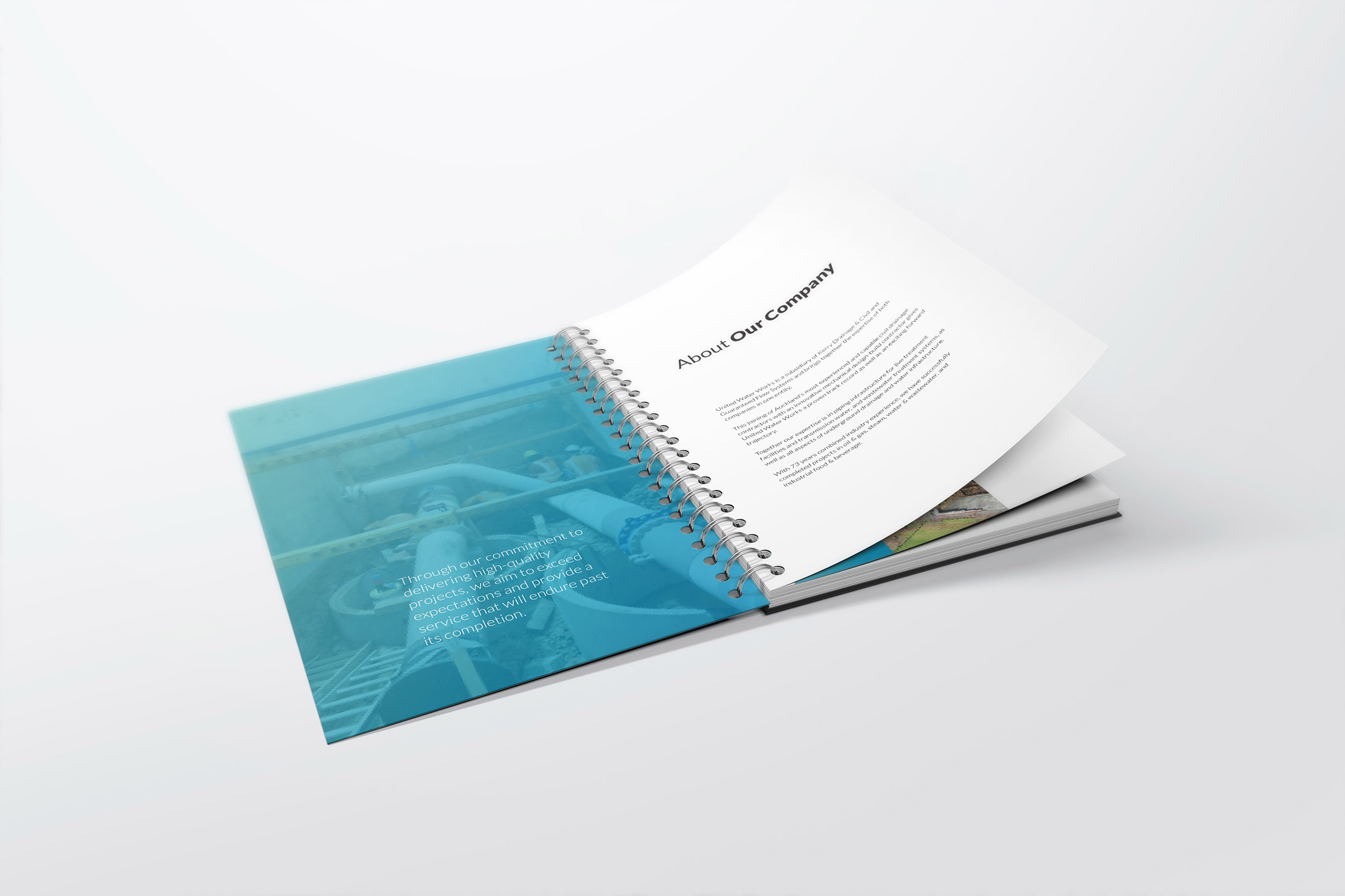
This joining of Auckland’s most experienced and capable civil drainage contractors with an innovative mechanical design-build contractor gives United Water Works a proven track record as well as an exciting forward trajectory.
Together their expertise is in piping infrastructure for live treatment facilities and transmission water, and wastewater treatment systems, as well as all aspects of underground drainage and water infrastructure. With 73 years combined industry experience, they have successfully completed projects in oil & gas, steam, water & wastewater, and industrial food & beverage.
Home > Graphic Design > Branding > Branding & Logo Design – United Water Works
The icon is an engineered water drop. Created using interlocking plates, it represents the pipes and systems that United Water Works designs, fabricates and installs. This references technology, precision and construction. A simple sans serif font in bold is used to convey seriousness, confidence and professionalism.
The font has modern, stylised letter forms to show innovation. The stacked variation on white is the primary application of the logo.
There is also a gradient background for United Water Works. When this background is applied, the white versions of the logo must be used. The white versions have the icon shadow removed.

Crisp white backgrounds, alongside block areas covered by the gradient colour or background images, creates a slick & professional look for all marketing collateral.
For letterheads, invoices and other business documents, use the colour logo on white. For marketing materials, adding full page images with the gradient overlays creates a cohesive brand identity and helps visually connect different materials.

The United Water Works gradient can be applied over photographs in three ways to create images that connect strongly to the brand.