Client: Hamish and Sally from The Maintainers, Blenheim
Brief: To create the branding for a new Blenheim property maintenance company providing Handy Man services, Lawn Mowing, Gardening and Cleaning in the Marlborough Region.
Hamish and Sally approached us to create their logo when they were planning a move back home from Australia and setting up their new business. As a new company, they wanted the logo to represent what they did visually, while also creating a brand professional and bold enough to create cut-through in the market, and appeal to a wide range of customers – including both larger companies and agencies for tenders, as well as individual clients.
The design brief was interesting as Hamish and Sally had a very different aesthetic of what they love in a brand mark. Hamish preferred more bold, masculine styled logos and Sally preferred more minimalist and feminine logos. For the concepts, I presented some options that catered to both of these aesthetics, and in the end we found one that was a happy medium between the two.
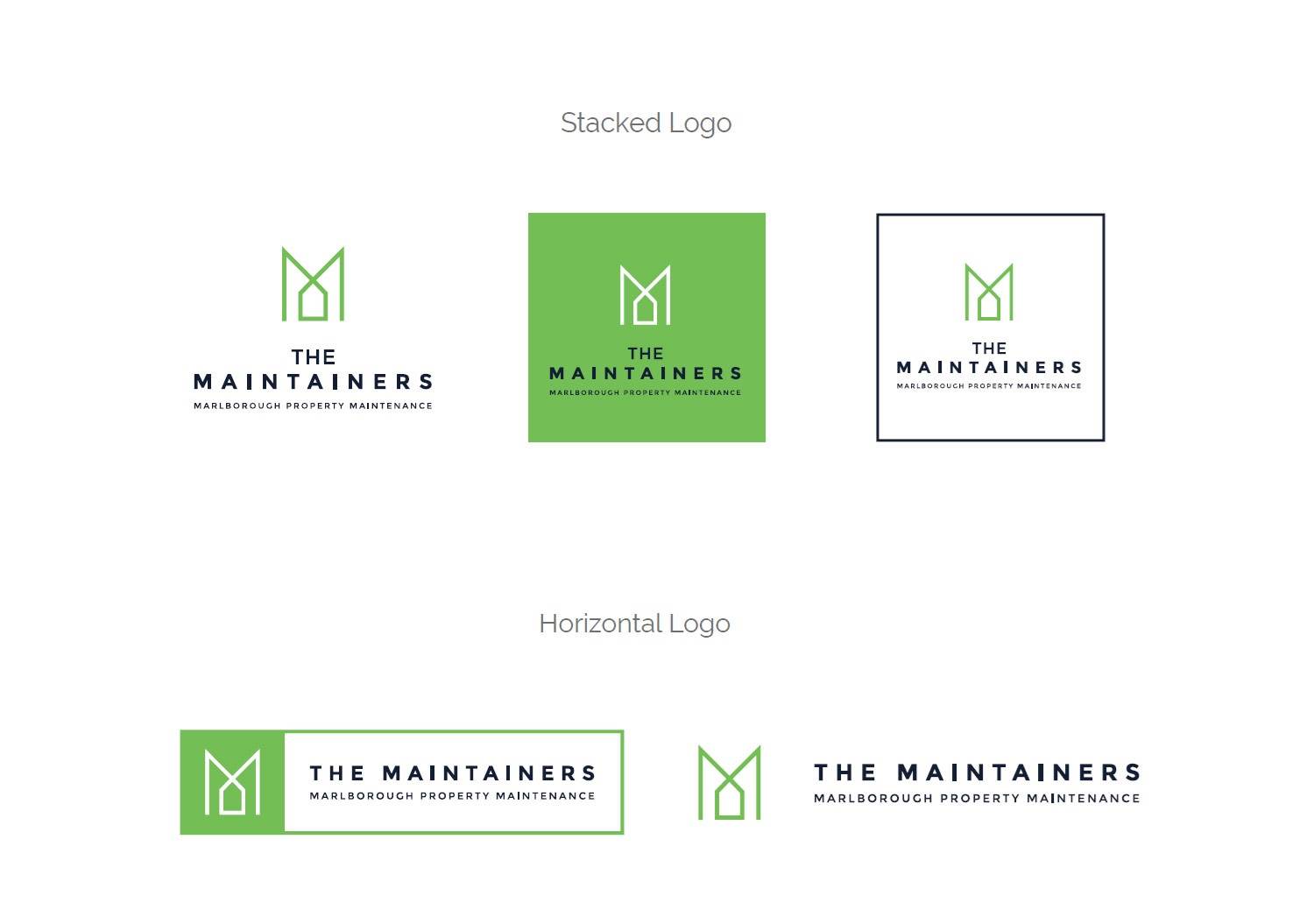
The Maintainers logo was created from the joining of the elements of the capital letter ‘M’ and a simplified outline of a house. The result was a classic, minimalist icon.
We created a whole range of logo variations for them to use, as well as reversed options for all with white lettering. This means that they have a very versatile brand that can be easily used to fit a variety of placement requirements.
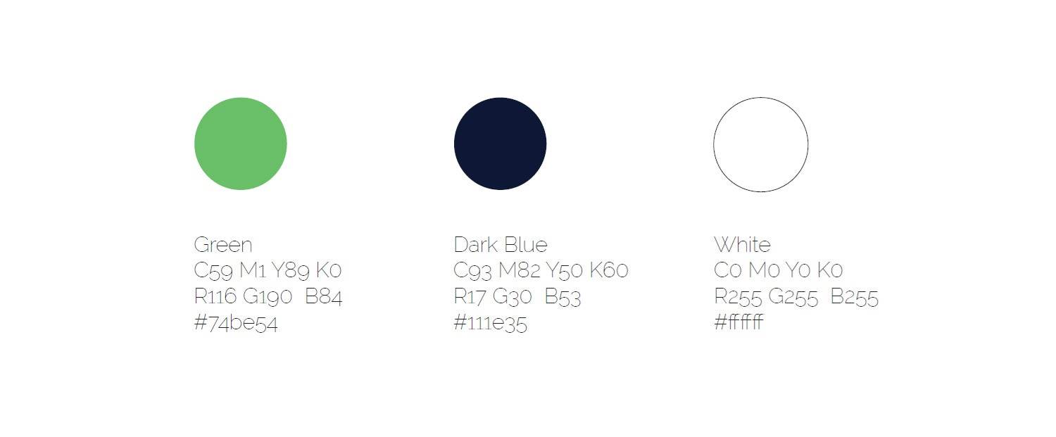
We chose a vibrant green and a deep navy for the colour palette. The choice of colour stemmed from the colour of grass and sustainability (green), as well as the colour of dependability and trust (blue).
