Client: The Little Dairy Co, Howick, Auckland
Brief: To create a cheeky & cheerful brand identity for a family-owned dairy company.
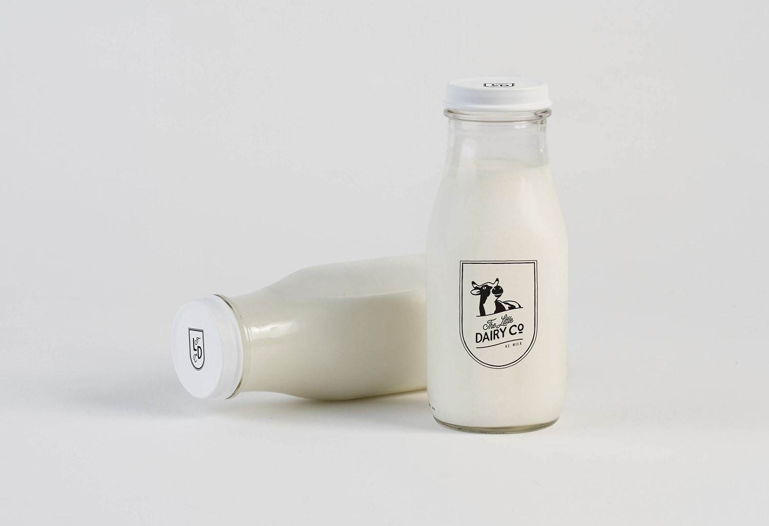
Lisa approached us to create a new logo and brand identity for the milk & dairy products produced by their family-owned Whangamata dairy farm. Their goal is to deliver milk in the old-fashioned way – in glass bottles on your doorstep, and reintroduce fellow Aucklanders to the local milk man (well, in this case – milk woman).
Their specialty is A2 milk from their herd of cows; all individually named and loved. With low stocking rates and semi-organic, the milk they produce is made with love and delivered with care.
One of the key features of the design brief was that it should be a little bit cheeky.
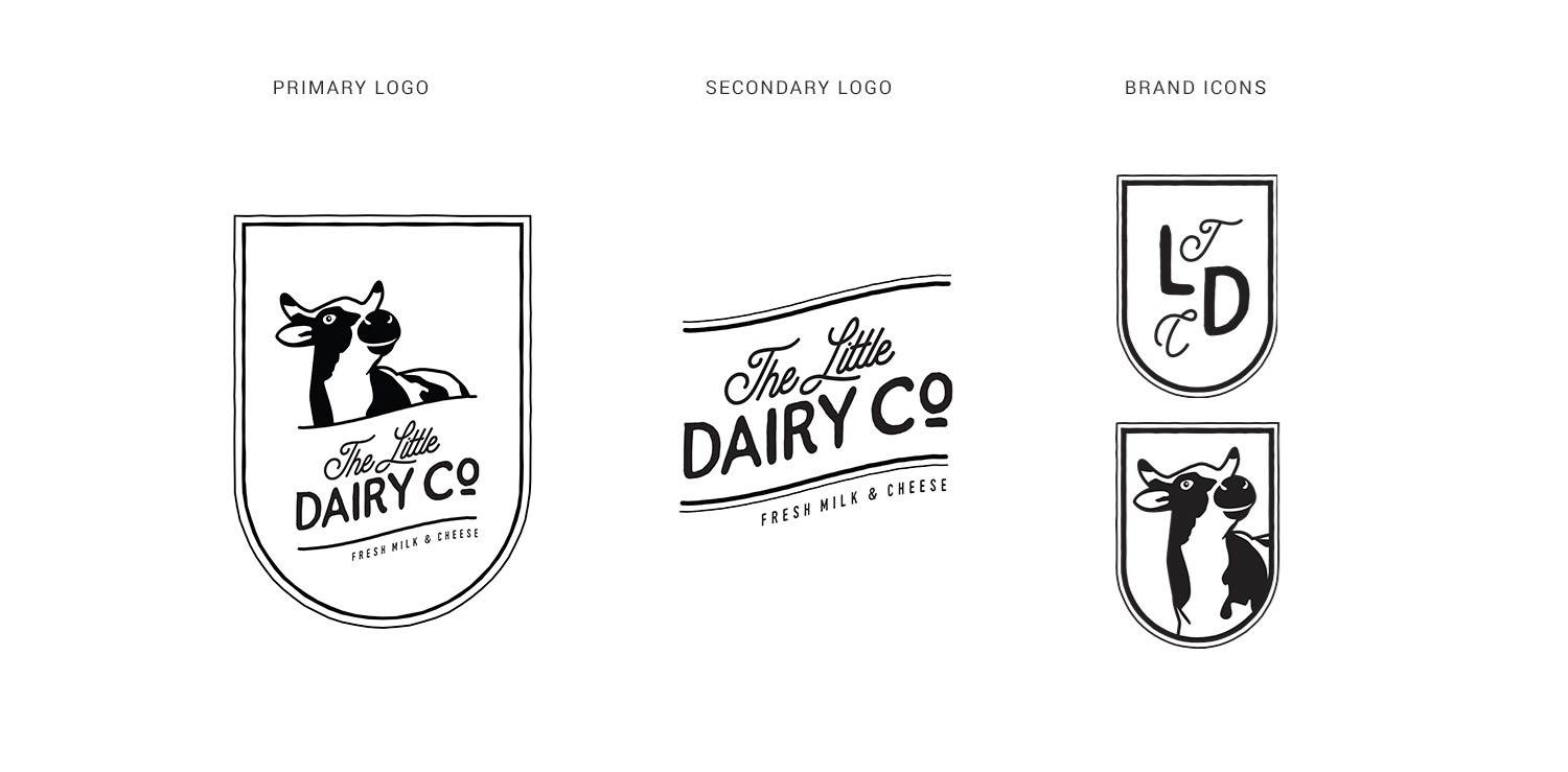
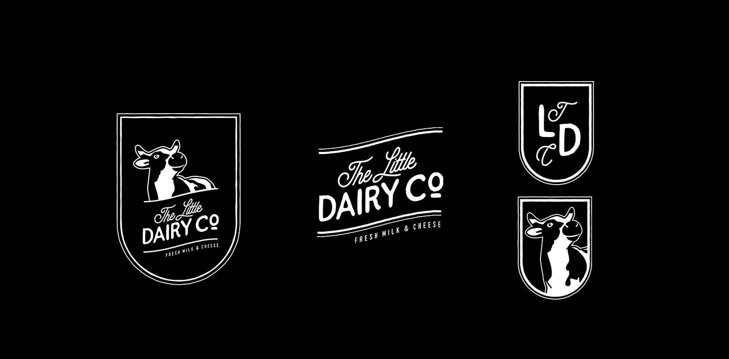
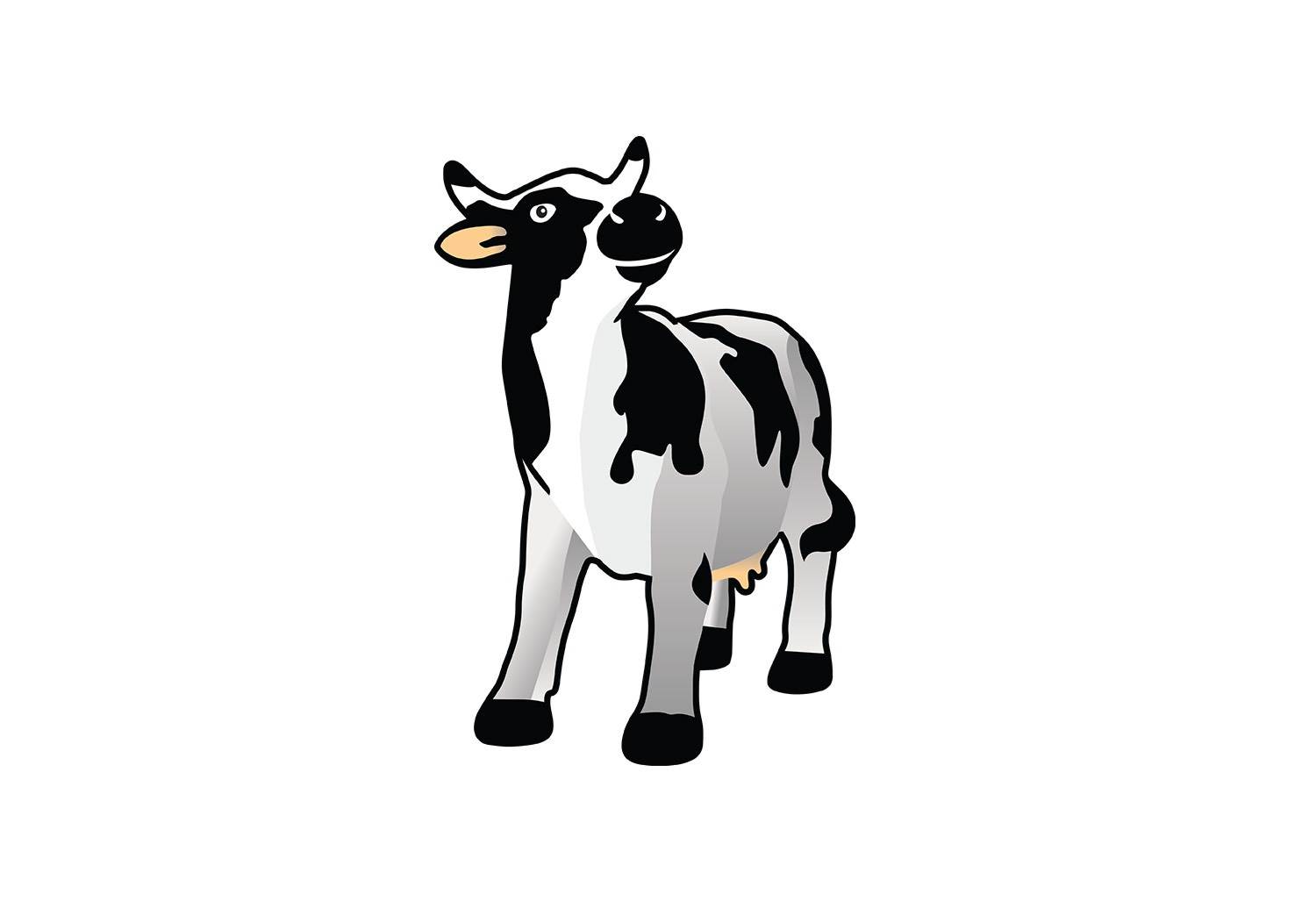
During our research phase, we found a cute little statue of a cow, which has become the mascot for The Little Dairy Co. Her pose was delightful, and to add to the cheekiness, and ensure it is a friendly brand – we gave her a little smile.
We chose fonts that have an earthy feel to them, which creates a warm, organic look. The script font adds a nostalgic touch.
The badge shape helps create a recognizable mark, as well as creating a bold logo for use on the bottles and branding. The lines are all slightly roughened to add to the natural, earthy feel. Curved lines add to the organic and sustainable vibe.
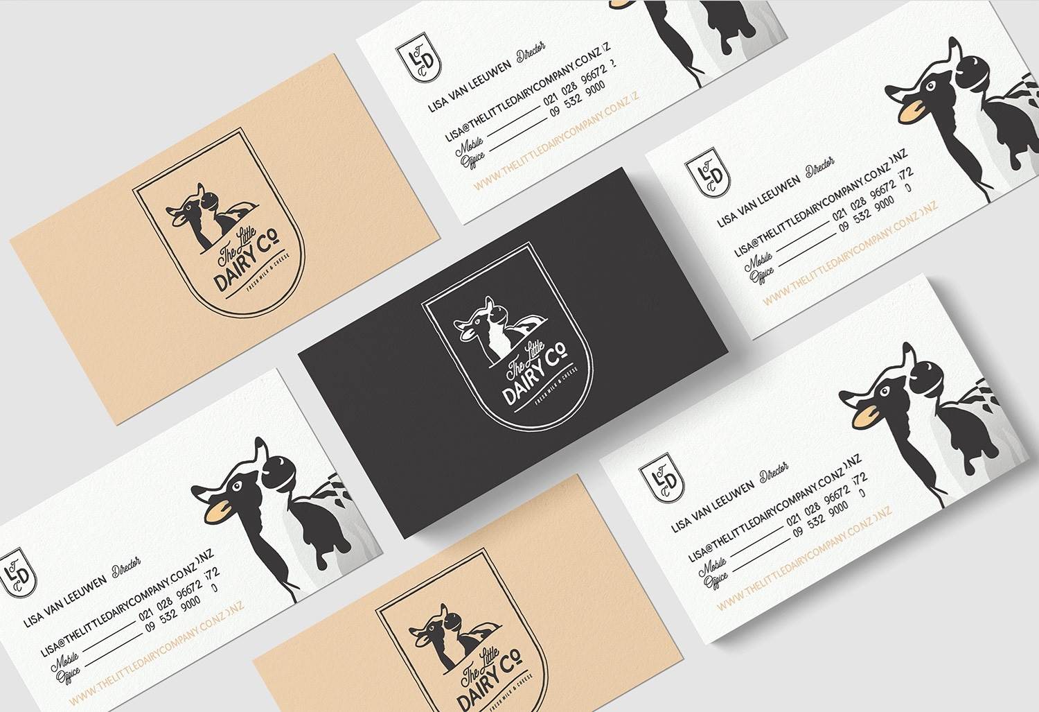
The primary colours for the brand are black and white, but we also have added in a peach colour that creates a lovely highlight for business cards, website design and other marketing material.
The finished brand conveys their company values of caring, cheerful, nostalgic, optimistic, sincere and sustainable well.
PROJECT SCOPE:
Branding | Business Card Design