Client: Toni from Ritual Massage
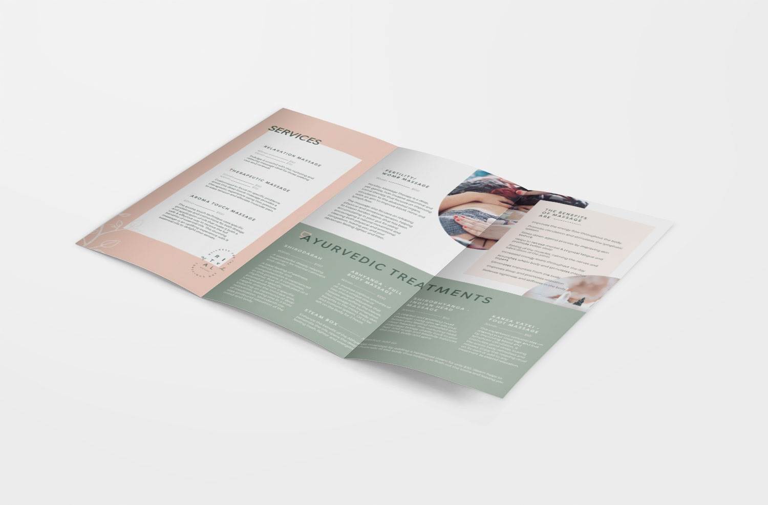
Brief: To create the branding for a new massage therapy business specialising in Ayurvedic treatments and fertility massage as well as relaxation, therapeutic and aroma touch massage.
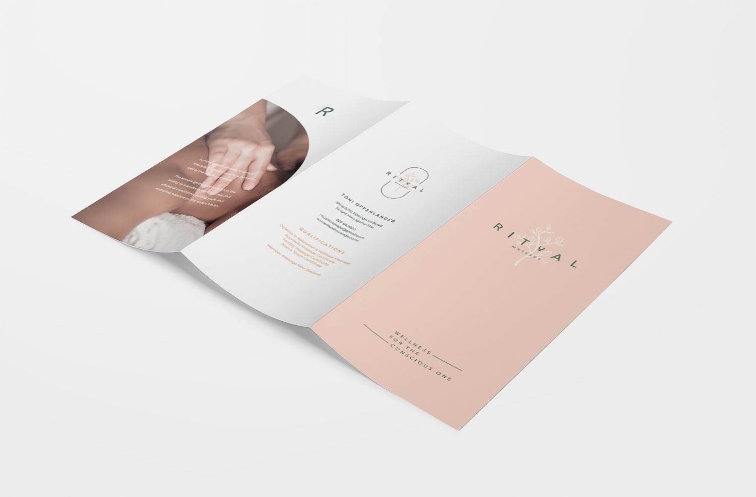
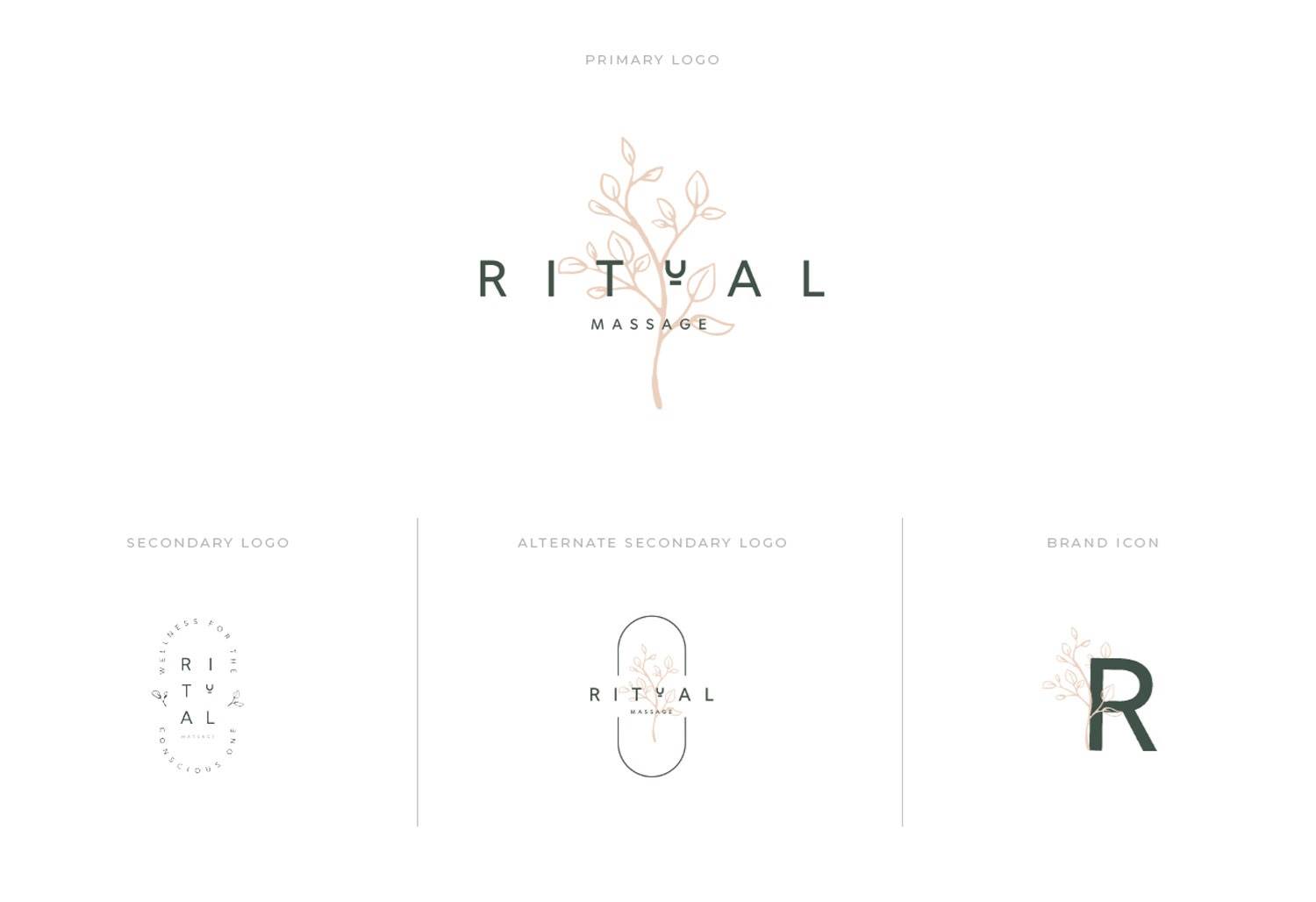
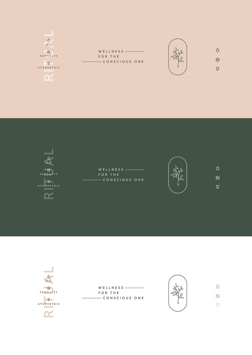
Working on this brand was a dream! Toni’s brand vision was very clear; we worked together looking at inspiration images and that created a solid foundation for us to move into the brand design with. We wanted to create a logo that had a connection to nature, and had an earthy, natural tone. We used arch structures to reference Ayerveda, as well as foliage imagery to create a connection to the natural world.
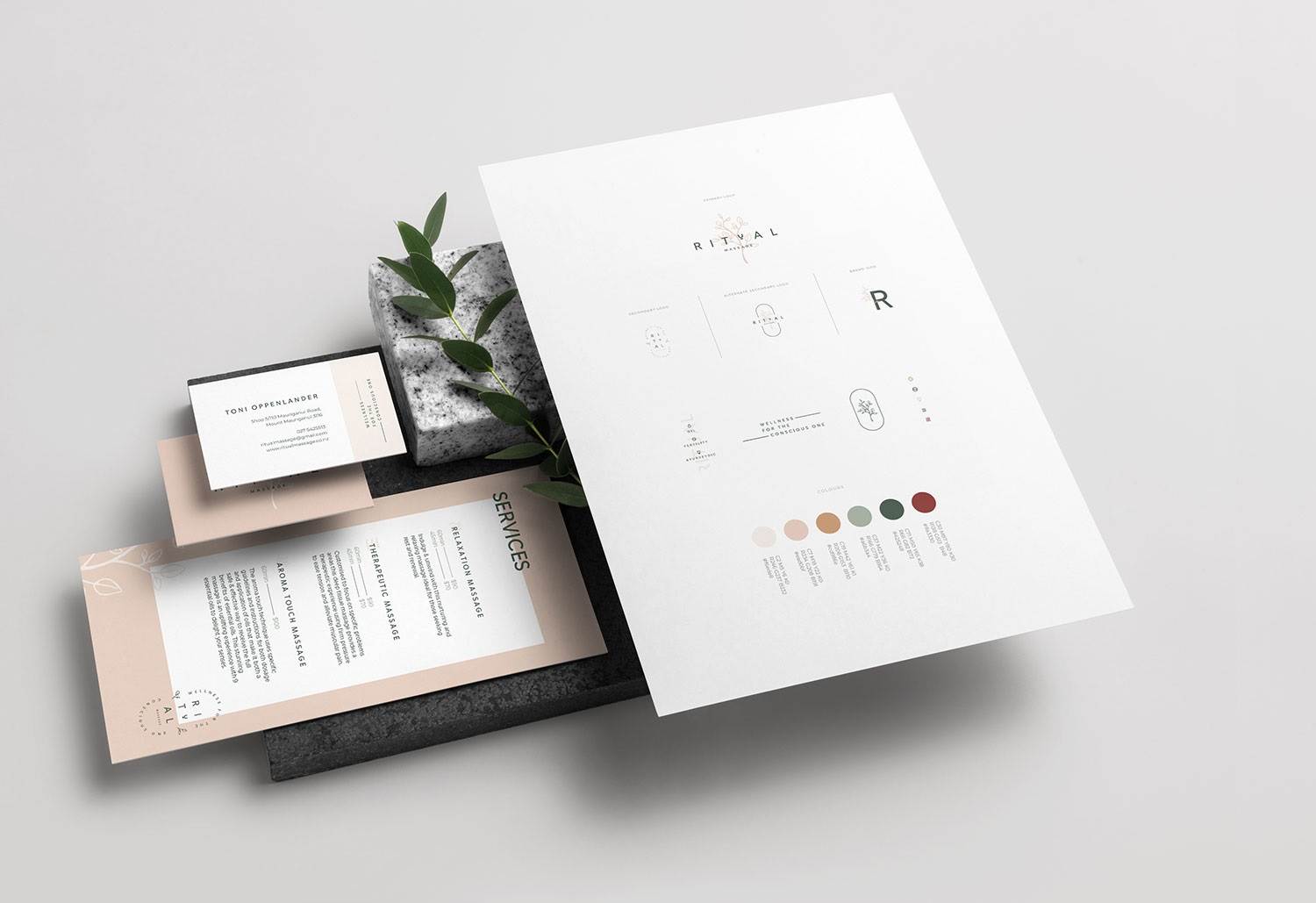
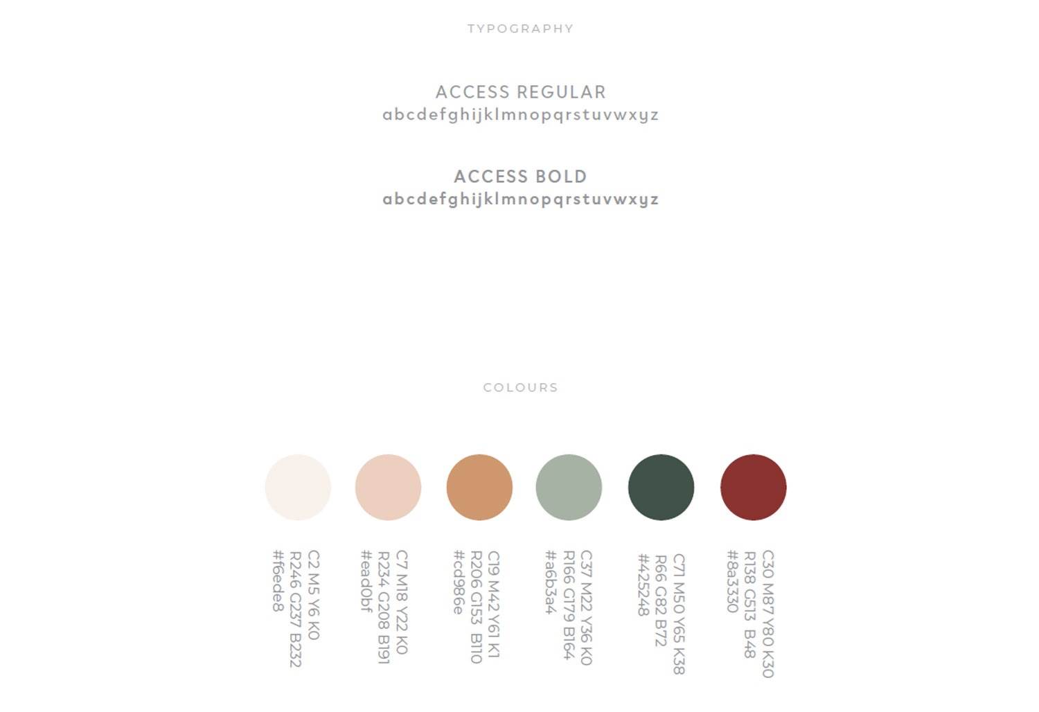
The word mark was created using a simple sans serif font, with wide kerning between the letters to create a sense of space and openness. We also created a stylised ‘U’ which is derived from the pestle which represents Ayerveda in our icon set. This makes a unique word-mark, that even when used without any associated brand imagery – is it instantly recognisable.
We created custom icons for each of the services, as well as a range of logo marks that can be used across her branding. We complemented this earthy and natural design by selecting pink clay and rich green tones.
When it came time to create the tri-fold brochure for Ritual Massage, to keep true to the brand tone, we edited the images to reduce their vibrancy. This is a great trick if you have a brand that has a more subdued tone to it. You can make your images reinforce your brand tone by reducing their saturation and vibrancy. For this project, it meant skin tones lost their deep yellow and brown tones, and took on more peachy, pink tones. Blues became more grey, and reds, maroon.