Client: The New Zealand Wedding Directory, Auckland
Brief: To create a new logo to bring a fresh, updated look and feel to the company, while appealing to brides, grooms and advertisers.
New owners Melissa and Tane contacted us to refresh the branding of the New Zealand Wedding Directory.
We discussed the look they were after and they wanted something modern, professional and recognisable.
As part of the discovery phase for logo design, we asked Melissa to show us some logos she liked. One was a brand that had a clever icon which combined a map pin with love hearts for a wedding venue website, and the other logo was a simple, round stamp design.
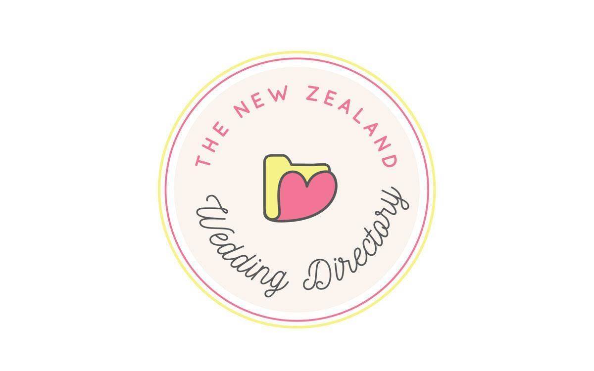
During my sketching phase, I brainstormed icons and imagery associated with weddings and directories. I was delighted when I realised that a folder was a symbolic representation of a directory and a heart a symbolic representation of a wedding, and love. So I combined the two into a striking icon which formed the heart of the brand. This was paired with a bold, readable script font, and a simple sans serif complimentary font. I created both a horizontal layout and a round stamp layout for versatility, colouring them in cheerful yellow and pink. The end result is a very playful and fun logo.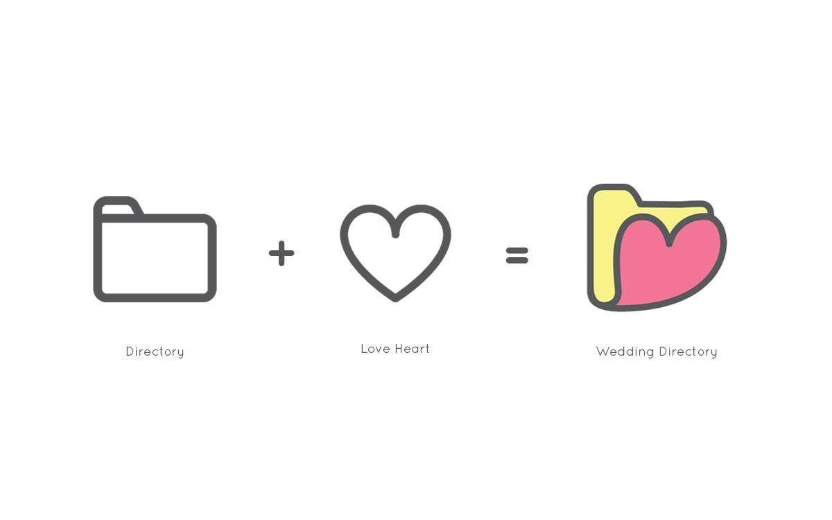
The next part of the project is a website update, but for now we have just changed the logo, and the homepage image – and we look forward to refreshing the rest of it later this year.