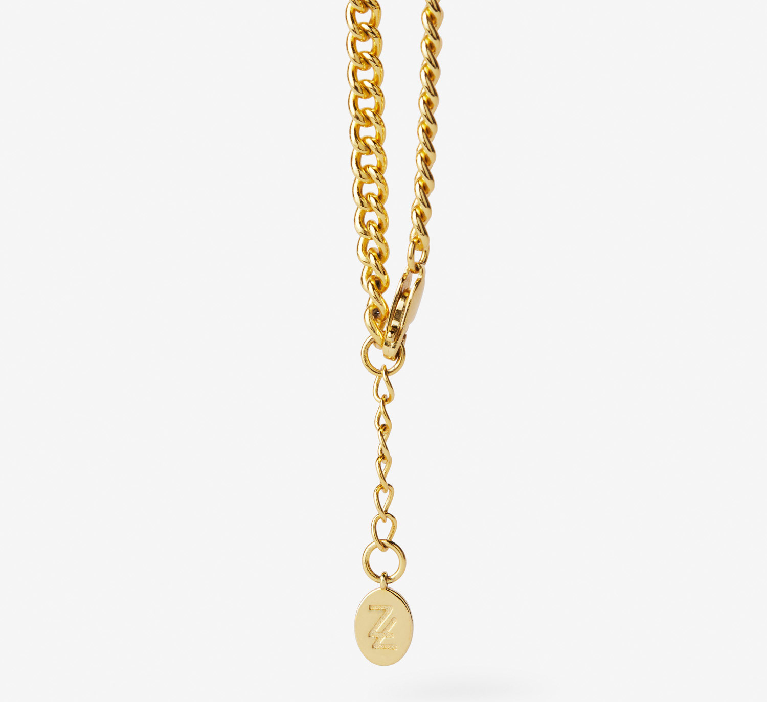
Founder Crystal reached out to us to create a full brand identity for Zoe Labouré – high-quality, beautiful, meaningful, faith-inspired jewellery brand.
The logo needed to look high-end & luxury, as well as present the dichotomy of the brand; that although Zoe Labouré occupies a traditional space, the pieces are elevated, current and fashion-forward.
A confident, minimalist, high-end and memorable brand identity was developed to directly speak to the customer that will wear Zoe Labouré. We needed to also create a brand that would adapt easily for both print and web needs, so a clean variety of marks were developed to serve the wide variety of uses that may be required.
Home > Graphic Design > Branding > Branding & Logo Design – Zoe Labouré
We pinned down the company purpose, road map, vision, values, key audiences, brand personality and the competitive landscape.
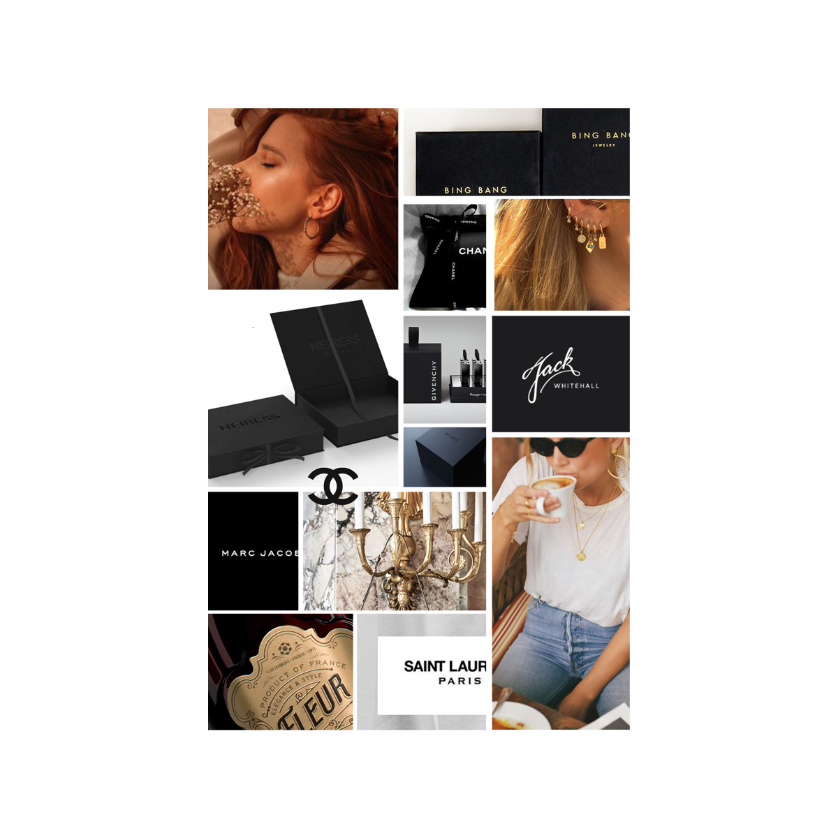
This provided a solid framework to develop the brand from. After finalising the brand strategy, we created a mood board based on our research and that set the path for the visual language for the brand.
The way the front of the Z has a finer tip than you would expect for the weight of the type, gives a feeling of elegance & refinement at the start of the logo. The rounded styling on the acute accent over the letter ‘e’ is designed to mimic the softness of the jewellery elements.
The vertical line of the ‘L’ has been sheared forward to create a memorable word mark and hint at the fact that this brand is a little more than meets the eye.
For the brand icon, the ‘L’ overlaps the ‘Z’. This mark fully represents the dichotomy of the brand – while the pieces are delicate and meaningful – this brand is presented in a surprising, assertive and unexpected way. There are two variations of the brand icon – one which sits inside an oval shape, and another that sits on its own.
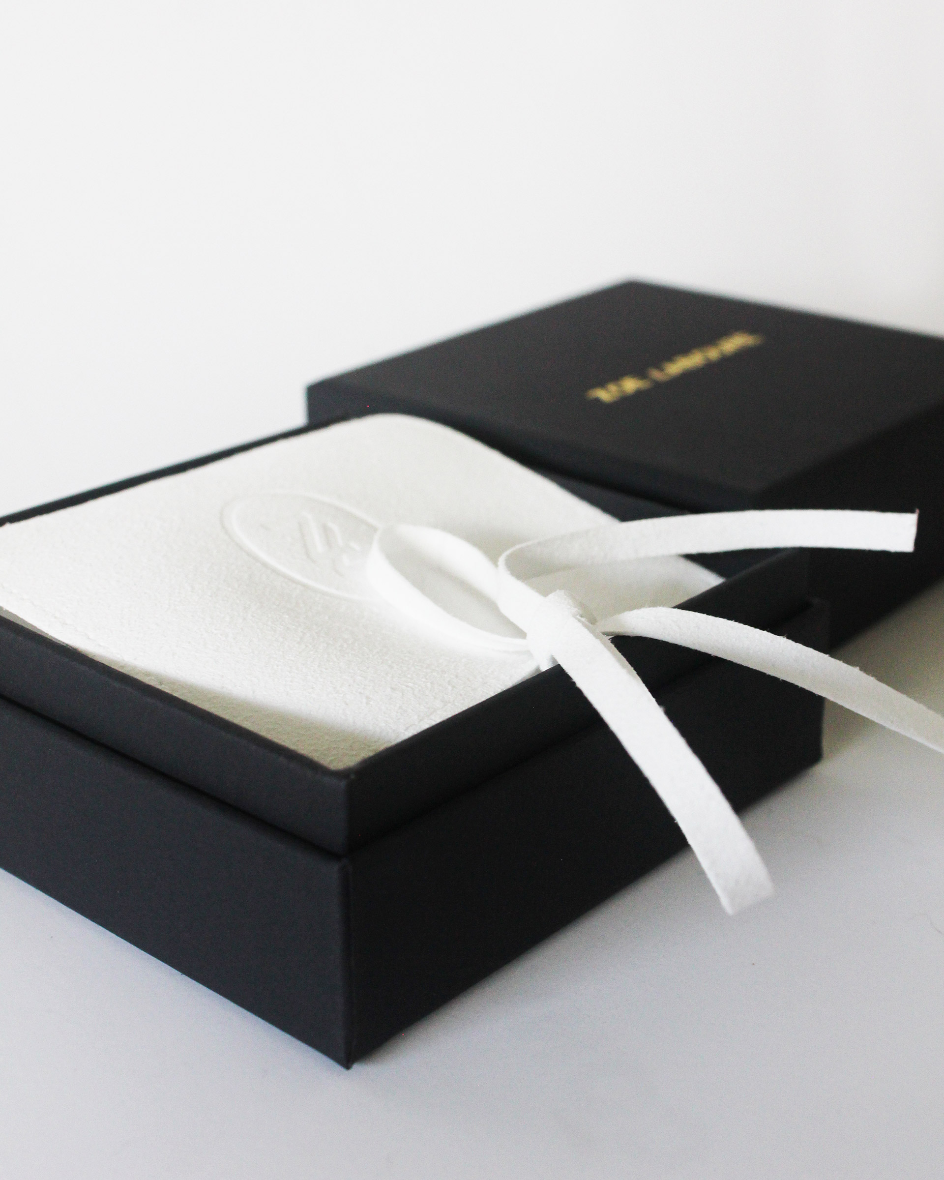
We wrapped this branding design project exactly one year ago, and we’ve been working with Crystal as she has been diligently working behind the scenes developing the packaging, manufacturing the product range, organising photography and building the website.