Envy Web & Design Logo White Colour

Pure Journeys UI Design

Pure Journeys wanted a full refresh of their brand and online presence.

After completing their new brand identity, we then looked at their e-commerce website UI design. Creating new designs for the homepage, tour search results page and individual tour page.

The Pure Journeys website is developed in-house, so we provided these final design files and design components to their developer to implement. He then used these three designs to implement refreshes of every page on the website.

Project Details

Client
Services
Industry
Travel & Tourism

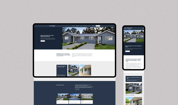
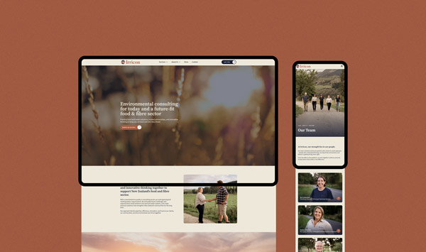
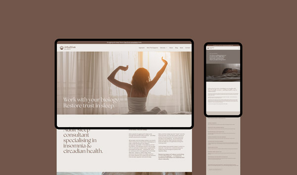
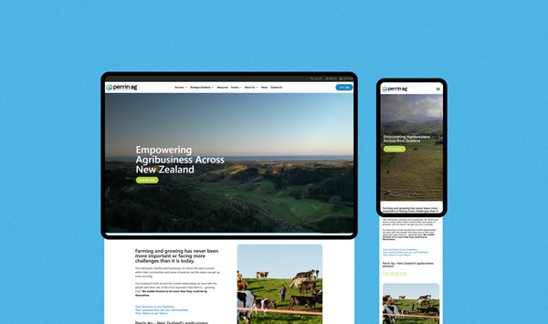
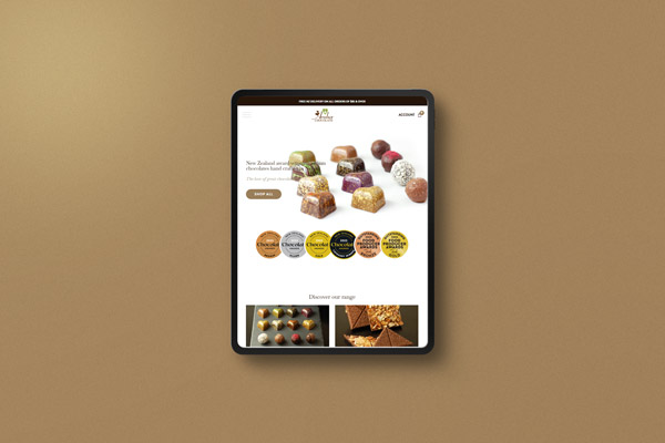
We used the new brand identity to create a beautiful new UI design; following the fonts and colours set out in the brand guidelines.

Lato, in two weights, was used for the website font, and rounded buttons and corners of boxes were used to echo the slightly rounded features of the logo design. Soft drop shadows show on hover and images are used to bring colour to the site, as well as appeal to the users. Stock imagery used reflects the users themselves, to help the customers relate to the website and engage with the brand. 

The header featured a double navigation bar to hold all of the required elements, without feeling crowded (Currency, enquire button, login button, CTAs and navigation).

The map pin shape was used across the UI design to house images, and as bullet points in infographic design.

Pure Journeys What We Do Infograph

We used the dark blue colour from the brand as the predominant colour on the website design – featuring it as a gradient image overlay where text was required over images, to assist with legibility and create a cohesive design. It was also used in the header and footer. The light blue and orange were reserved for calls to action.

Pure Journeys Call To Action Design Ui Design Website Ecommerce

Check out some similar projects.