Logo Design - Meno Central™

Meno Central™ is an online platform that is changing the way New Zealanders view menopause.

Their mission is to end the stigma, provide trusted resources, and empower women with knowledge and choice throughout their menopause journey. The website will be a resource hub for women where they will find resources, information and access to trusted wellness providers around New Zealand.

INDUSTRY: Women's Health & Wellness

Project Details

Services
Industry
Women's Health & Wellness
Technologies
Illustrator

For Meno Central, we created a logo that felt confident, established, welcoming and would connect with a female audience. 

The typography we selected is a clean and simple serif font with some beautiful organic rounded details. The font feels modern, yet timeless, and sits nicely in the space of female wellness.  

The stacked version is the primary logo and there is a nice interplay between the two words to show connection, community and togetherness. This is carried over to the brand icon, where the positioning of the two letters are swapped around to make sure it is read M then C.

Until the website is built in early 2025, a simple landing page has been created.

Colour Palette

For the colour palette we chose red and peach as the primary colours. Red is an invigorating colour that represents energy, passion, power and confidence. This helps this new brand sit with strength in its place and show a confident and reputable presence when people visit the website.

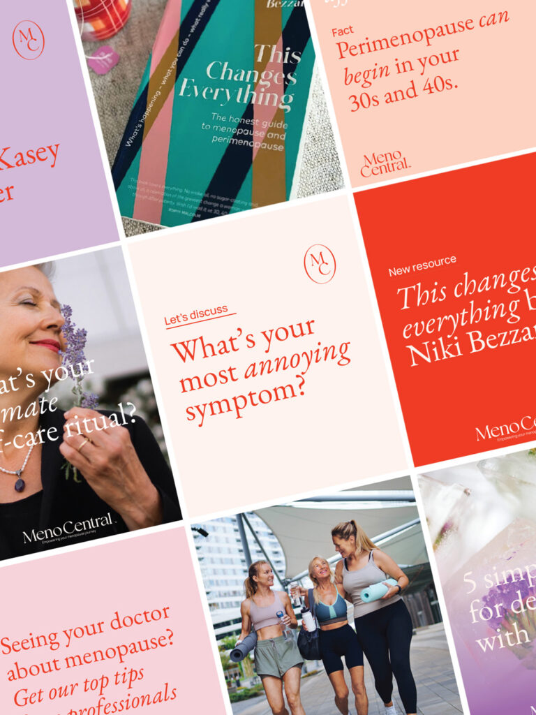
The secondary colour palette consists of lighter peaches, pinks and purples. Used consistently across social media platforms – along with the typography – this will create a recognisable brand. 

Typography 

For all marketing and website content, two fonts have been selected. A simple, rounded sans serif, and a beautiful serif font – that is used in regular and italic to show emphasis where wanted.

Meno Central Brand Colours

Image selection

Images should reflect the values and attributes of Meno Central, as they are powerful communicators. 

Photographs used in Meno Central web and marketing are calming in their colour palette; not overly saturated. Ideally they use brand colours where possible, such as peaches, purple & pink, along with complimentary tones such as navy & teal; not primary colours like yellow, bright blue or vivid yellow-based greens.

Meno Central Main Logo
Meno Central Main Logo Brand Icon
Meno Central Main Logo Peach Horizontal
Meno Central Instagram Feed Posts
Meno Central Main Logo Peach
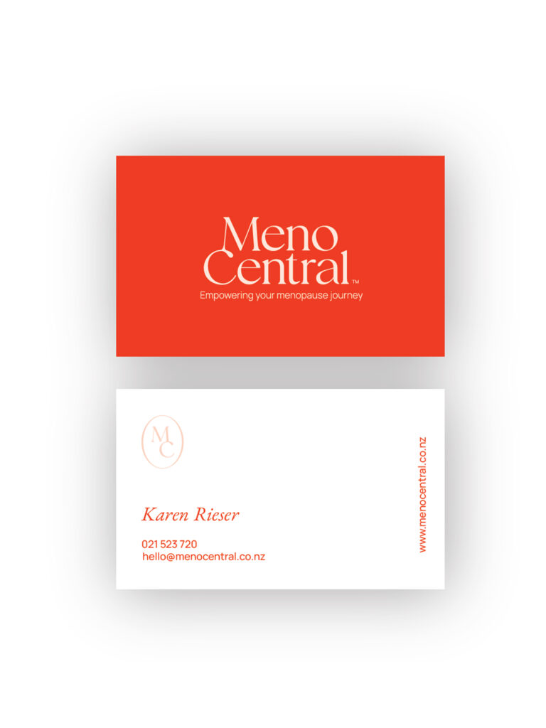
Meno Central Business Cards

Business Card Design

The business card uses the bold red background to grab attention, then the back is a clean white card with text. The brand icon is used in peach for a touch of elegance.

Check out some similar projects.

We'll take your business further with a hands-on approach; always going the extra mile.