Client: Perrin Ag Consultants, Rotorua
Brief: To redesign the original company logo – to take the company branding forward with a refreshed brand identity.
The team at Perrin Ag approached us to help them undertake a full rebrand. The original logo was designed by the company founder over 10 years ago and the team wanted a modern, new logo that aligned with their company identity. We started with an in-house brand workshop, where key members of the team gathered to discuss brand values, target audience, purpose, brand personality, goals and more. From there, we were able to take our learnings and use them as the basis to create the new logo concept for Perrin Ag.
ORIGINAL LOGO

NEW LOGO

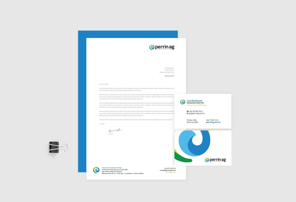
Four vibrant colours were chosen for the logo that represent land, water and sky. These colours are different shades from Perrin Ag’s competitors and will stand out in the marketplace, also conveying a positive & uplifting tone, as well as presenting the all-important connection between land and water.
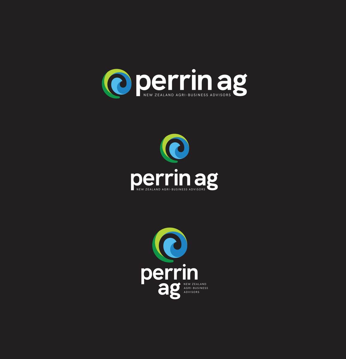
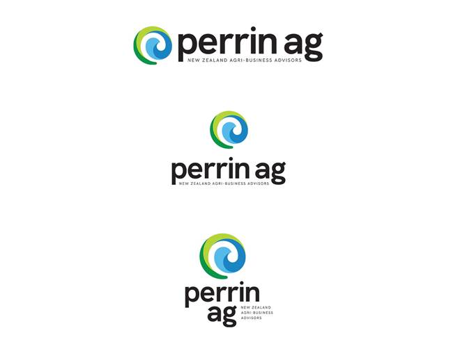
To aid readability we made the lettering lower case. This will mean that the logo will always be read as Perrin Ag – not Perrin A.G. To better align the brand with the image and services Perrin Ag provide, we have also removed the word ‘consultants’ from the logo. The lower-case lettering also conveys a sense of relatability and personal connection, with a bold sans serif font that is reminiscent of the current logo text – and conveys dependability, solidity and trust.
Using the existing logo design as the bounding board, the new icon represents the land, the water and Mokoia island. The land circles around the outside of the icon, the water sits in the middle like a lake and the white space represents the island in the middle of the lake.
The koru motif, portrays the connection to Māori land owners, as well as new beginnings, growth and regeneration.
For visual balance, as well as to position the brand correctly, a new tag line has been added. We also provided logo variations with the tagline in Te Reo.
The circular shape of the logo as well as the shape of the koru, convey the idea of perpetual movement. This helps to reinforce the values of integrity and passion. The negative space which represents the koru, is nestled in close to the positive, coloured shape – which helps communicate the values of community and team work. The icon was created using a series of overlapping circles.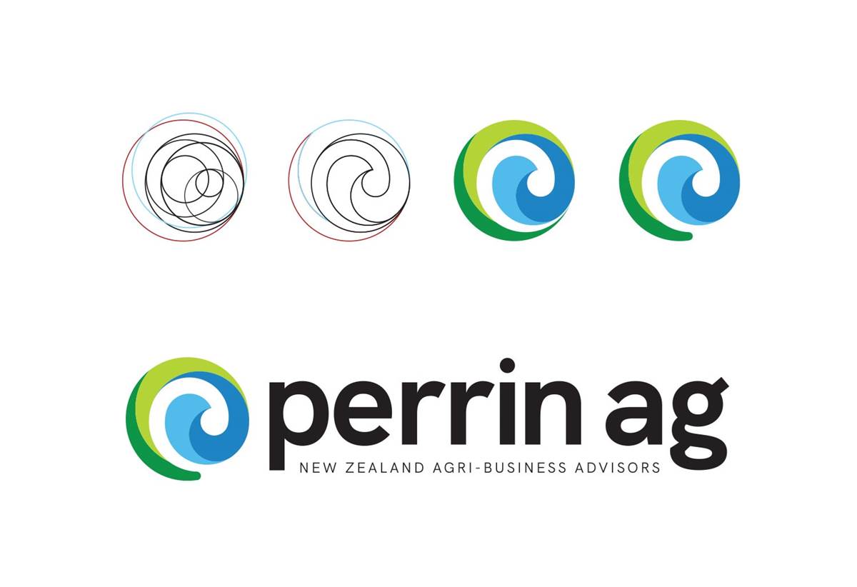
What the new logo means to the company is best described by managing director Lee here:
“Our tohu, or logo, represents our deep connection to the place our business started, Rotorua. Updated in 2019, this logo design also references the original logo created by company founder John Perrin.
The land circles around the outside of the icon, the dark green of our forests and the light green of our pastures. The water sits in the centre like our lake, Rotorua-nui-a Kahumatamoemoe, fed by the dark blue waters of the underground aquifers and the light blue water from the sky. The heart of the tohu, between all the colours, represents Mokoia, the island in the centre of Rotorua.
Four colours also reference our business’ four values – passion, integrity, community and teamwork.
The koru motif portrays the new beginnings, growth and regeneration that come when we hold true to our values and use our land and water resources responsibly.”