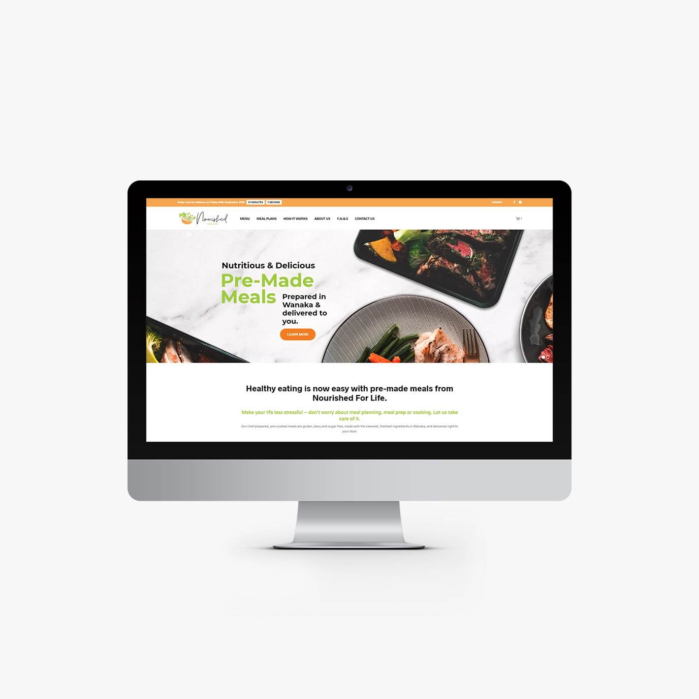
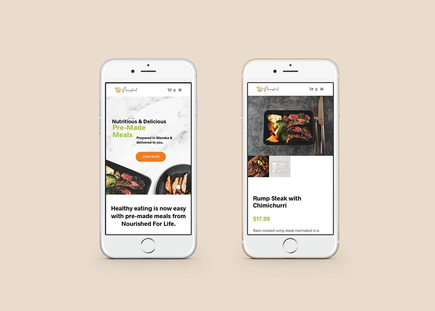
Client: Nourished For Life, Wanaka
Brief: To create a bold, vibrant and lively logo for a new Wanaka company creating nutritious ready meals, delivered to you.
Eerika, Zeb and Ivan’s vision is to create a company that comes alongside people to meet their need for fast and healthy food. Their meals, prepared by chef Ivan, are for busy people who might not have time to cook, or just want the peace of mind that their food is portion controlled, and meets their dietary needs while also being delicious.
We met up with the Nourished For Life team and had a chat about what they were looking for in their branding. We discussed the creation of an icon, script text for their logo, with a bold, but welcoming tone.
Once we had all of the information collected, the next step in the logo design process was hand sketching. Using pencil and paper allows us to be freer with our design concepts, unconstrained by the computer. It means we can get ideas on paper very quickly, and move on from ones that don’t have as much potential as others.
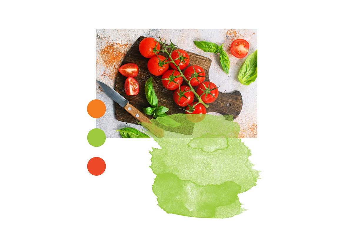
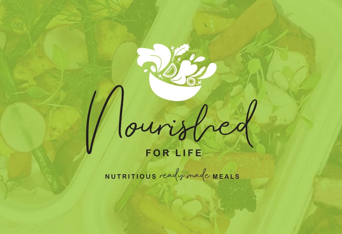
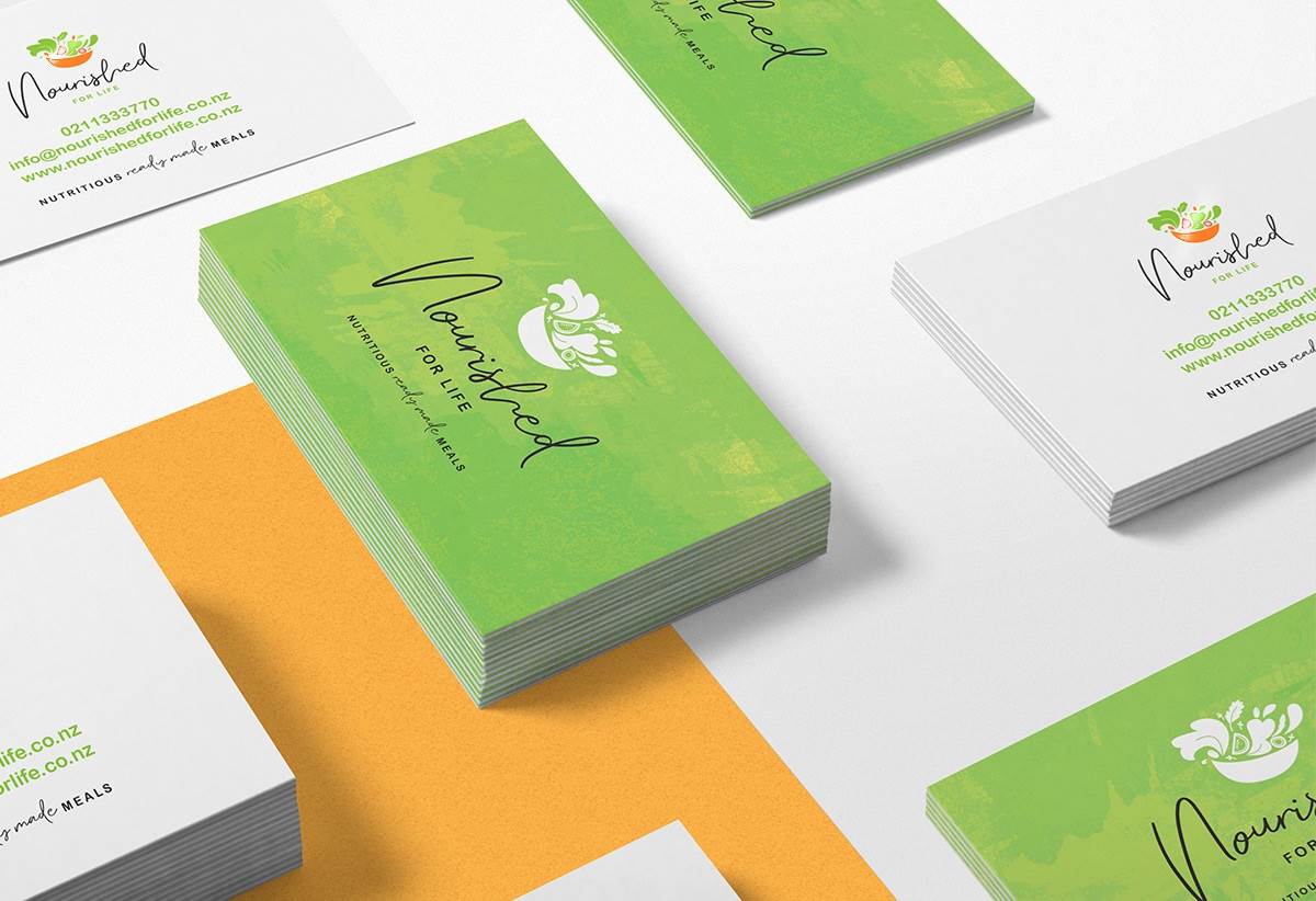
For this project, there was one concept that stood out from the rest. It was a salad bowl that showed a lot of motion – by illustrating it tipping slightly forward, and having the salad leaves, micro greens, tomatoes and other vegetables leaping out of it, we created a feeling of action and movement.
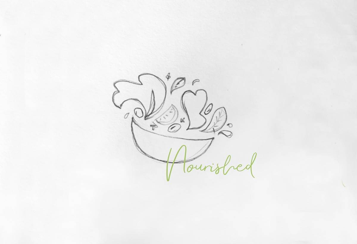
In the vector stage we made a few tweaks to the design – adjusting the exact placement and type of vegetables used, but the final design stays true to the initial concept.
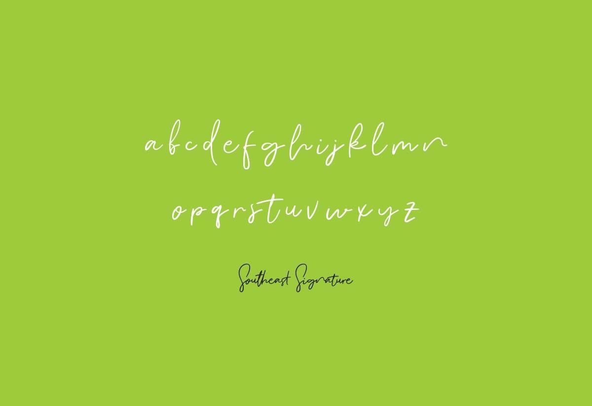
For type, at the very start we had discussed a relaxed script for the word ‘Nourished’ with ‘FOR LIFE’ sitting underneath and smaller in all caps. The main font Southeast Signature is a beautiful font that is flowing but not too feminine, as well as being very readable and still bold. We paired this with a simple rounded sans serif font.
For colours we chose a vibrant palette of bright green, red and orange.