Client: Elite Yacht & Property Management, Coromandel
Brief: To create a contemporary, high-end and professional brand for Elite Yacht & Property Management – a luxury property and boat management company based in the Coromandel.
When Morgan and Toni first approached us to create the branding for their new company, it was at the height of the 2020 lock downs during the global pandemic. Based out of San Diego, the pair were planning ahead for their return to New Zealand, and wanted to get their branding ready so that when they eventually were able to set foot on NZ soil, their new company could get up and running right away.
The logo needed to convey a sense of professionalism, trust, focus as well as present a best-in-class image of the company. It needed to present Elite as a reliable, understated and – elite.
Owners Morgan Drew and Toni Vettoretti have spent years working on superyachts around the world. They will be offering a first-class solution for discerning property and yacht owners in the Coromandel.
Elite want to be seen as their clients’ own private staff; trained to the “superyacht standard” with a level of professionalism and attention to detail that won’t be found anywhere else – for peace of mind and an unparalleled level of attention to detail.
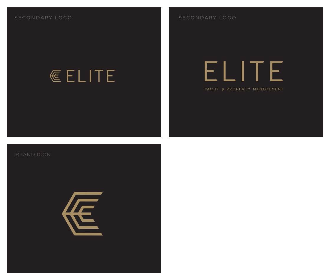
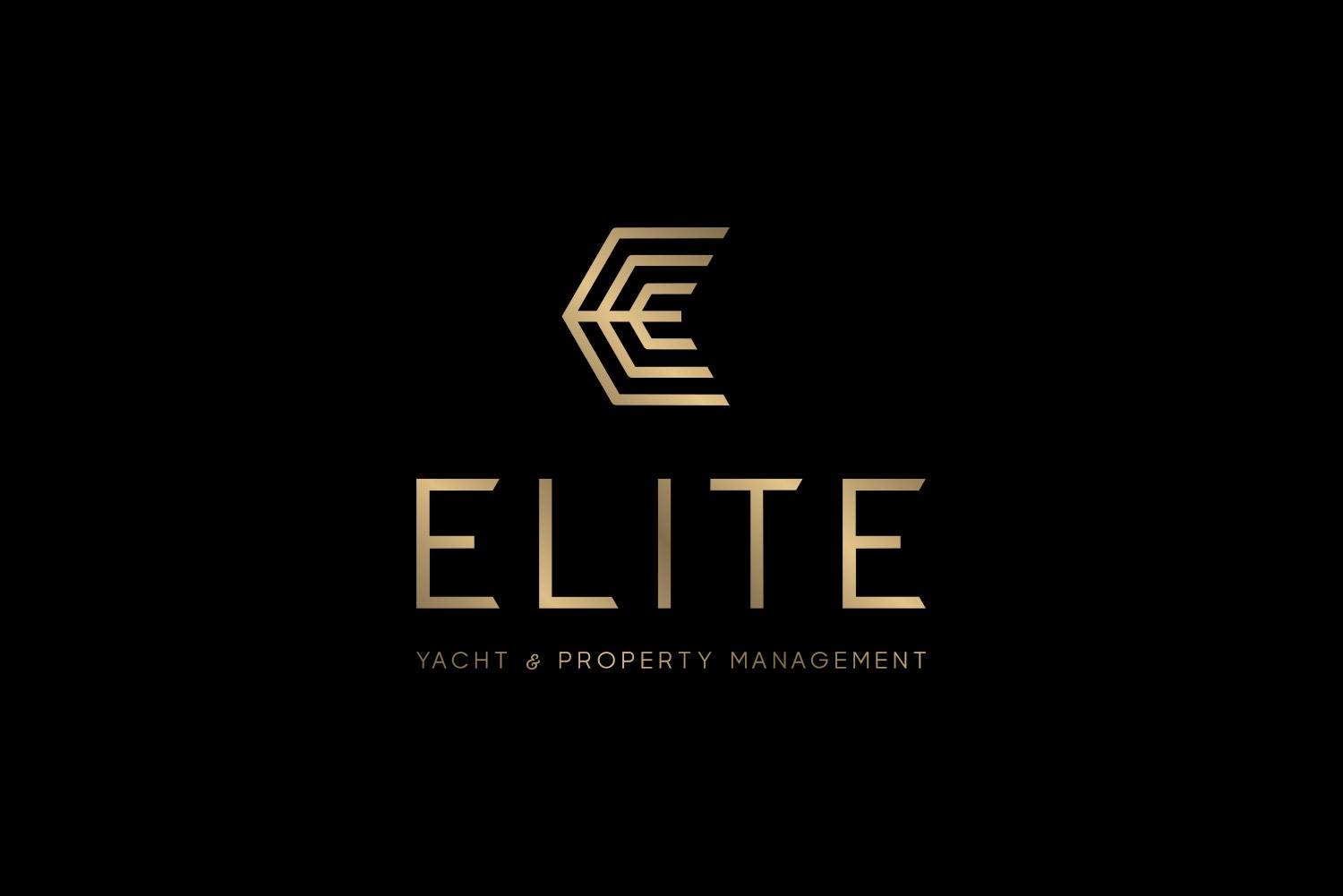
The brand icon for Elite was formed around the stylized shape of the letter E. There are two more E letter forms that encircle the centre mark – these represent the two arms of Elite – Yacht & Property.
A simple sans serif font was chosen for the lettering. This font has been stylised by shearing off the ends of the letters to echo the design of the brand mark. This sharp typography communicates focus and precision.
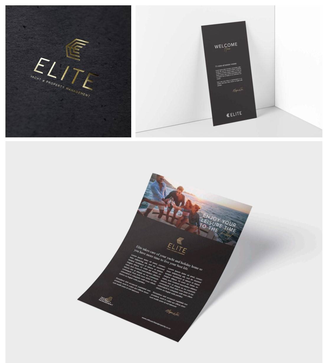
For colours, we chose gold on black. Both a gradient version and a flat gold version were supplied for the logo.The stacked, flat gold variation on black is the primary application of the logo. A gold gradient variation is provided for digital use only. For the most important assets, gold foil on black card was recommended.
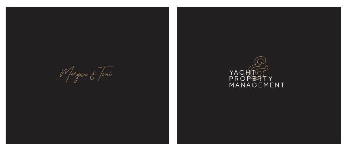
There are two supporting marks for Elite – a signature, as well as a tag-line lock-up. The signature can be used small, to reflect the personal touch and attention to detail that is part of Elite’s brand identity.
The tag-line lock-up can be used on marketing materials as an additional way to emphases the services, as well as create visual interest. This could work well on
a design that features the logo without the tag-line, or just the brand icon. A pattern was also created from the brand icon.

PROJECT SCOPE:
Branding | Graphic Design