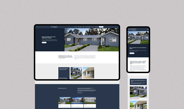
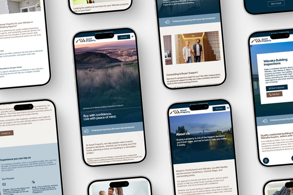
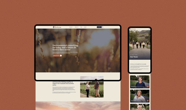
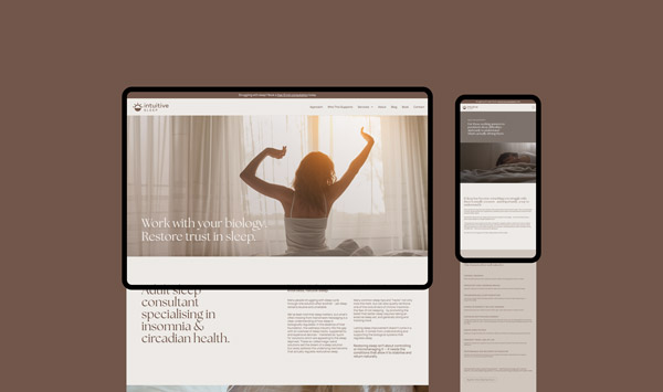
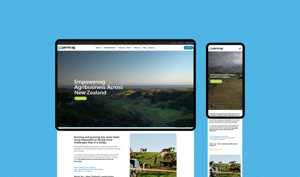
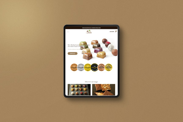
The redesign needed to look current, and make sure that new visitors to the site felt reassured by a modern and sophisticated looking website.
To facilitate a better responsive experience, and a much more user-friendly page build, we installed Elementor to design the pages.
The existing company logo remained during the rebuild process, and the fonts they were using already conveyed an up-market feel – so we kept those during the process. A modern and professional serif font is used for main headings, and this is paired with a really nice serif font for sub headings, which adds some elegance to the website.
We used a mix of client images, and carefully selected stock images, to present a clean and professional design that reflects Reid Produce Co.’s commitment to quality. The use of high-quality images and a cohesive color scheme enhances the user experience and aligns with the company’s brand as a leading food processor in Hawke’s Bay.
Comprehensive Product Information
The main catalyst for the redesign was to focus on improving the product information for new potential client meetings in Japan. We reimagined the product page – ensuring detailed descriptions of products were organized for easy navigation. This allows customers to quickly find information relevant to their needs.
Clear Calls to Action
Prominent ‘Enquire Now’ buttons and contact information make it easy for potential clients to reach out, facilitating better customer engagement, and helping to make it easy for customers to reach out.
Responsive Design for All Devices
As people are often viewing websites on their phones – and potentially new clients might take a quick look online after a meeting – it was key that the website was well-optimised for various devices – ensuring users have a seamless experience whether they’re on a desktop, tablet, or smartphone. This responsiveness caters to a broad audience, from local clients to international partners.