Client: Supreme Security, Rotorua
Brief: To create a clean, professional, bold and strong logo for a new Rotorua-based security company.
Jimmy & Simone approached us to create a brand identity for Supreme Security. They created the company in response to the growing need to house the homeless of Rotorua during the COVID-19 lockdown period.
With a background in the Department of Corrections, Jimmy & Simone bring a wealth of knowledge and experience to their work – creating a security presence that is more than just guarding a property, but prioritises focusing on the needs of the individual people they encounter in their work.
They had a clear vision for the brand which we were able to execute under a tight timeframe.
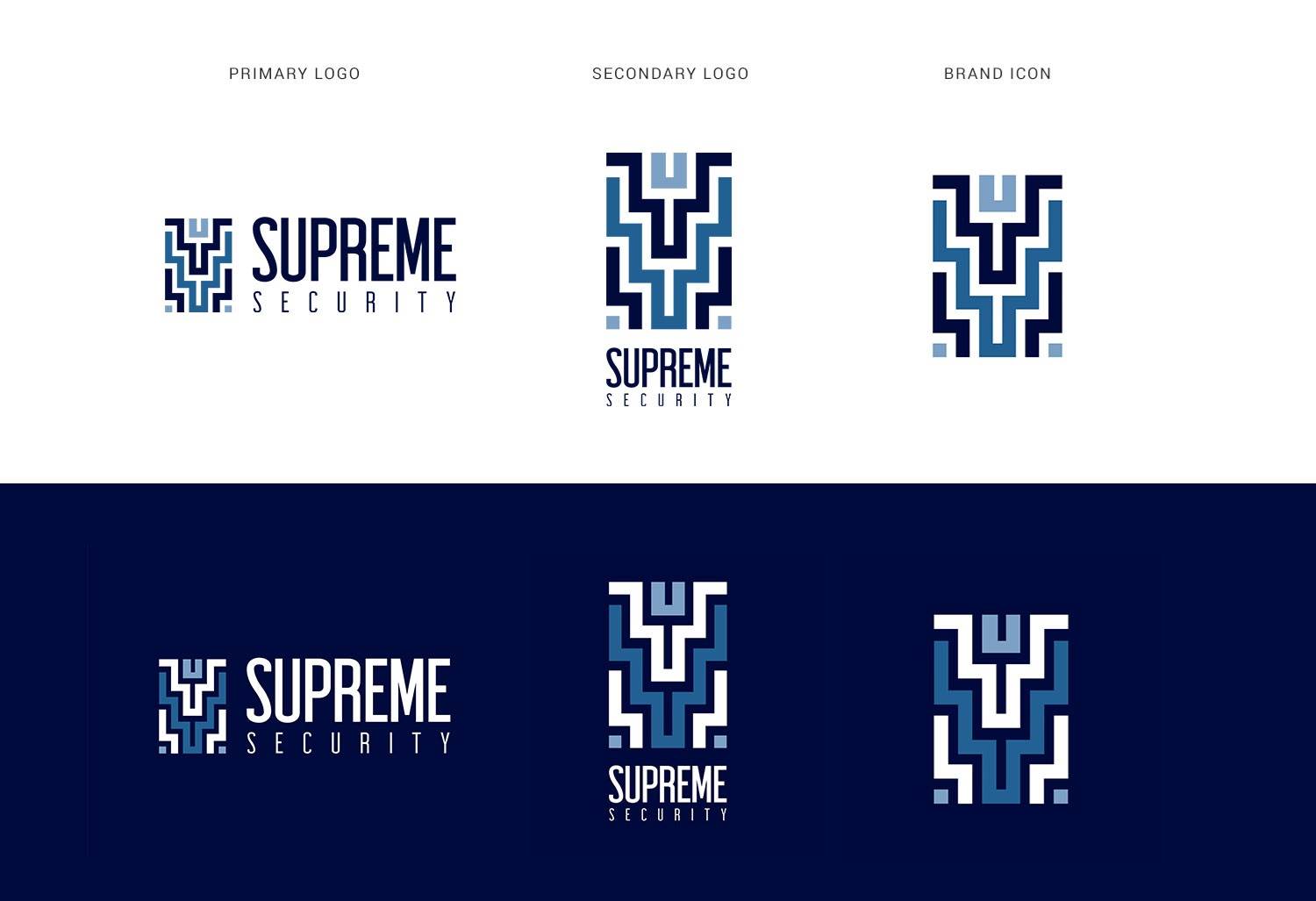
The chosen design used a poutama pattern which symbolises levels of learning, advancement and achievement. This is representative of their work to create better outcomes for the people they work with.
At the top of the icon there is also a person with their arms uplifted. This represents how their team lifts up and supports those they are entrusted to watch out for. The font is tall & strong – this communicates power, strength, dependability & trust. It also echoes the vertical design of the icon.
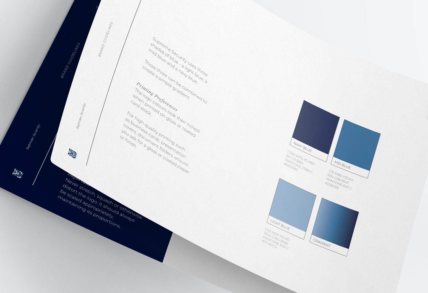
To create the Supreme Security brand we used three shades of blue – a light blue, a mid blue and a navy blue. In branding, blue communicates confidence, success, trust, reliability and has a calming effect.
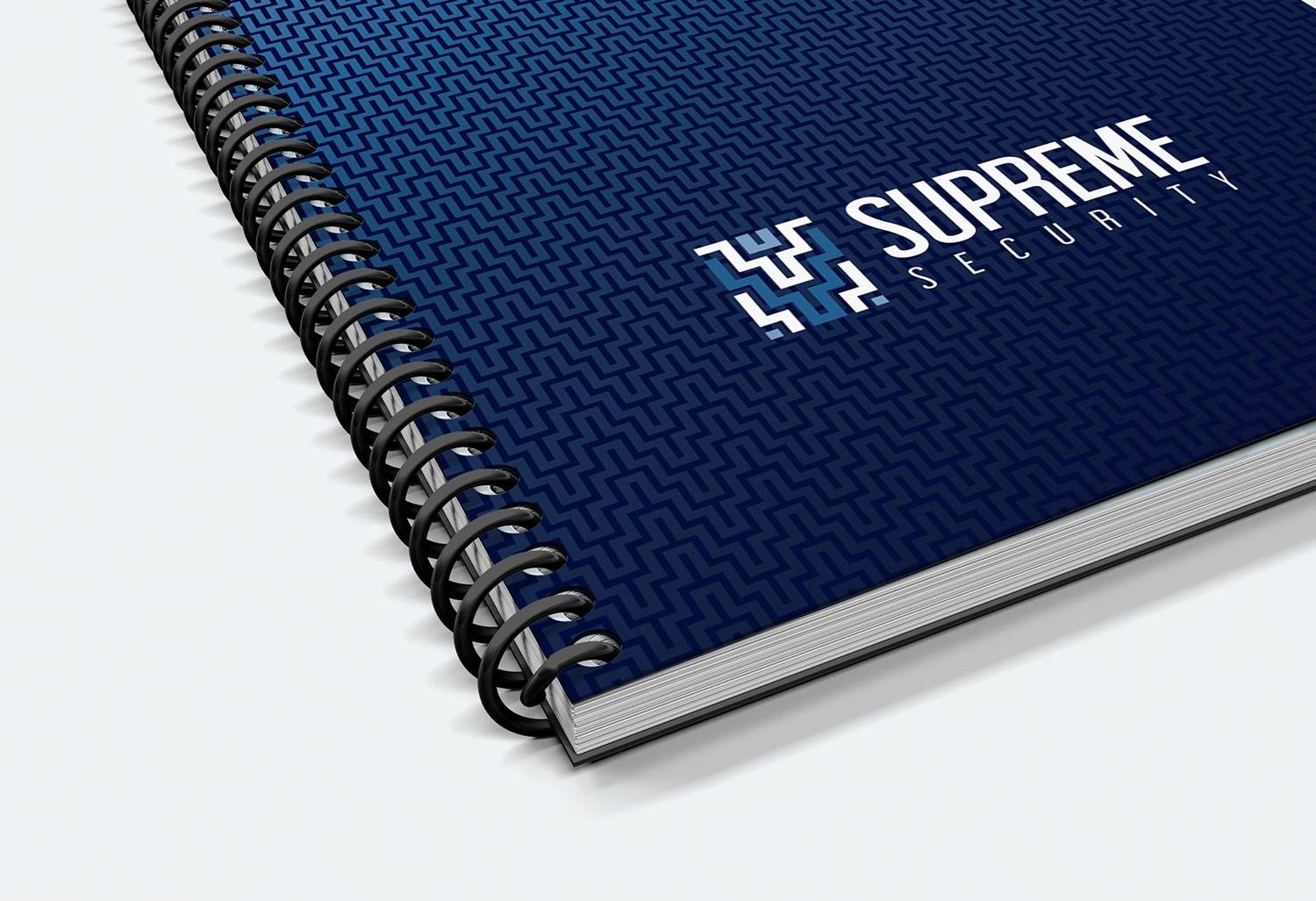
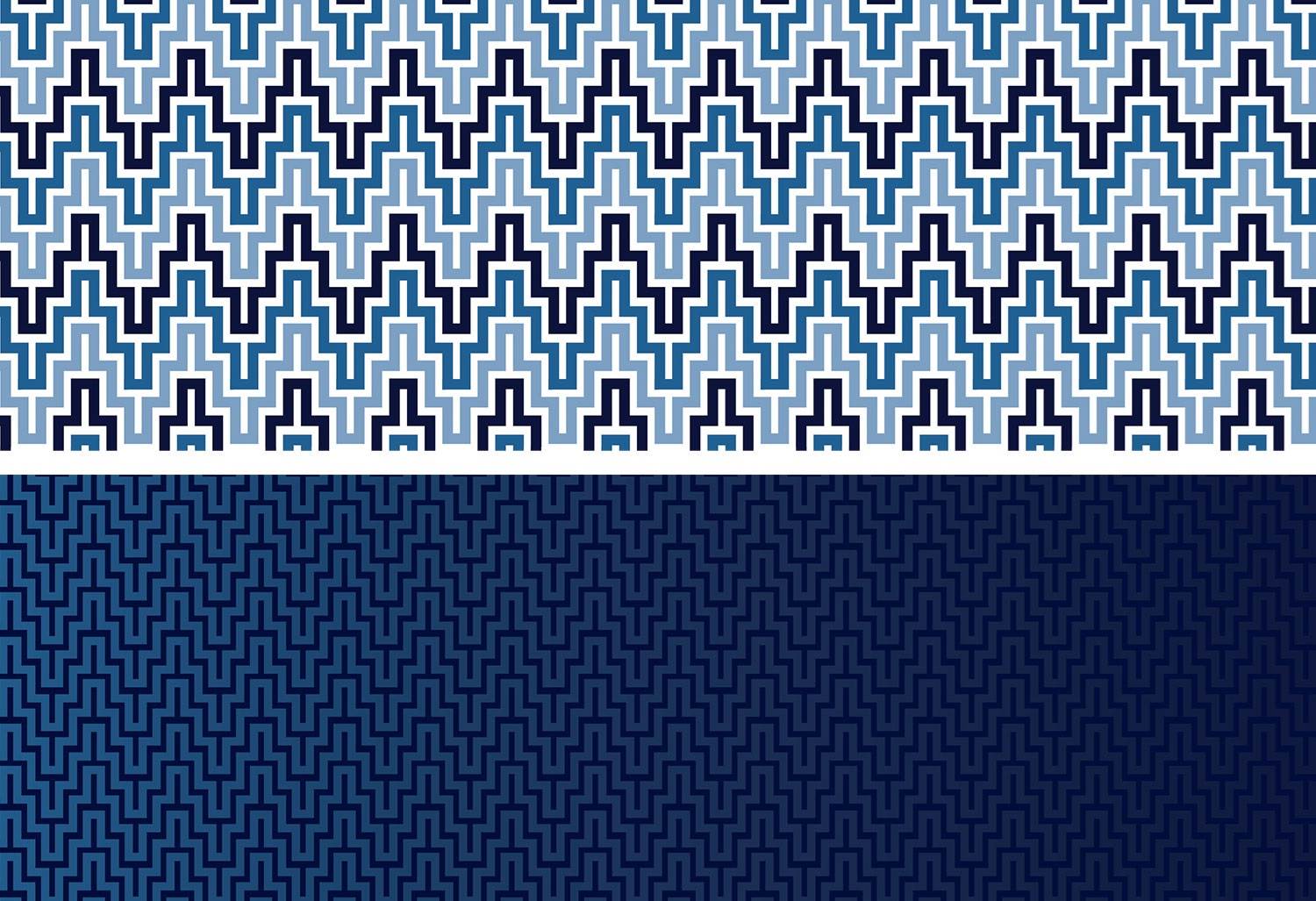
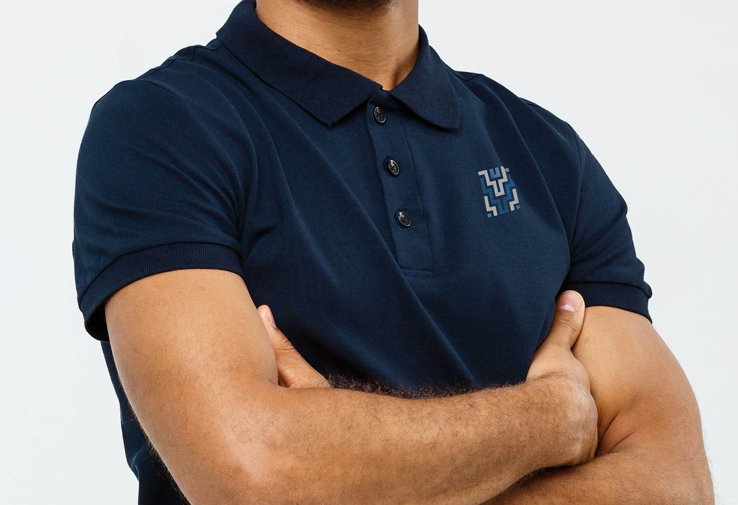
The horizontal variation on navy blue is the primary application of the logo. There is also a variation to be used on white, or very light grey. The poutama pattern used in the brand icon has been turned into a seamless pattern to be used as desired.
PROJECT SCOPE:
Branding | Graphic Design