Client: Look No Hands, Rotorua
Brief: To design a logo for a Rotorua-based company that creates hands-free & foot-operated door openers.
Look No Hands approached us to create a brand for them to take to market quickly, and that would create a simple and recognisable brand mark for their new company.
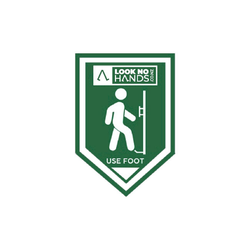
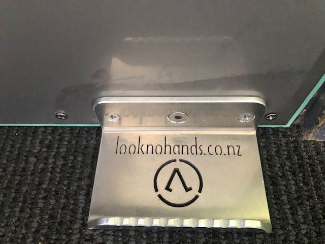
The non-contact door opener mounts on the bottom of the door, giving users the option to avoid the door handle and open the door with their foot.
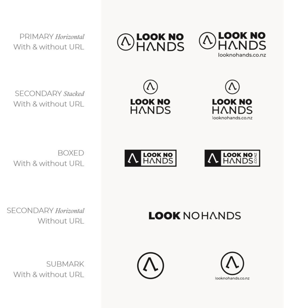
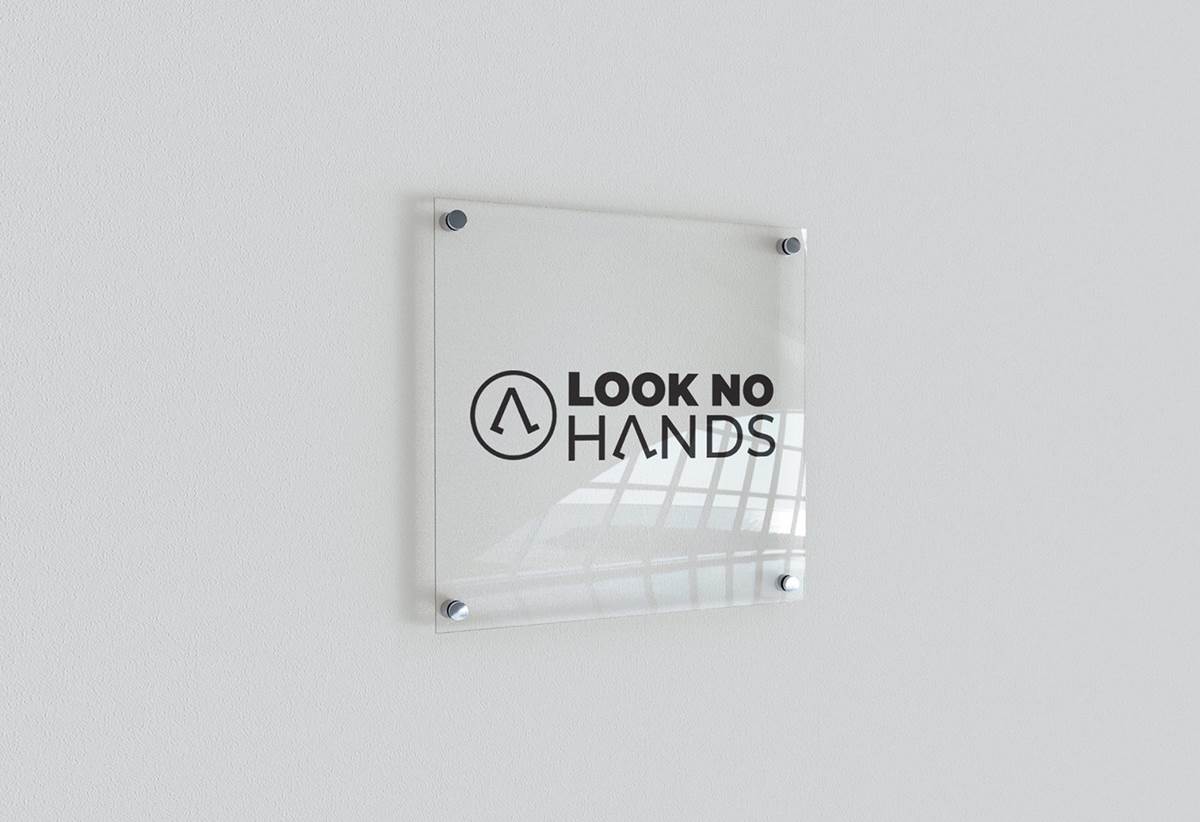
The logo needed to be able to be laser cut into the foot handle, needed to be easy to read quickly and the client wanted a positive and negative version of the logo.
When sketching ideas for the logo, we thought about visual imagery and iconography that immediately represented the concept of no contact with your hands, and the use of feet in the operation of the device. We presented two options, one for each.
The chosen logo focused on the feet element. It turned the letter ‘A’ in the words into a stylized image of legs & feet in a walking motion. This portrays the importance of your feet in using the product – turning the written meaning of HANDS into a visual representation of FEET.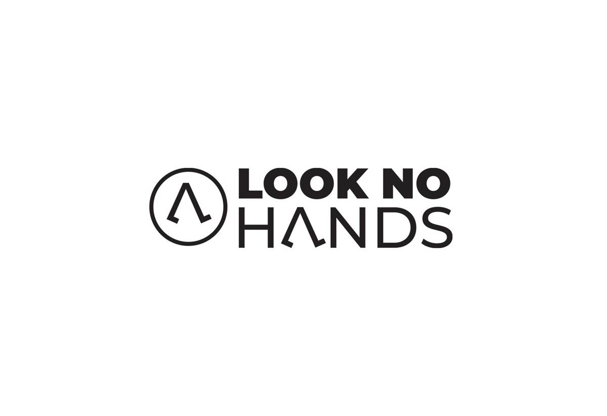 We chose a bold, sans serif font used in two weights; this is clear and legible at small or large sizes. We then created a circular icon mark out of the ‘A’ icon, that helps create an association with well-being and health.
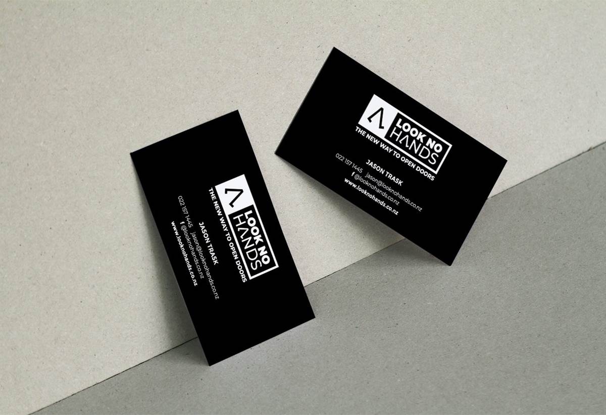
Thinking of the application on signage, we also gave them an alternate boxed variation of the logo. This can be reversed and creates a visually striking, compact variation of the logo.
The final brand identity is strong, clean and memorable. We also created the business cards using the boxed logo in white, on black card.
PROJECT SCOPE:
Branding | Graphic Design
Check them out:
looknohands.co.nz